Aviation gone digital – visual identity for a flight software
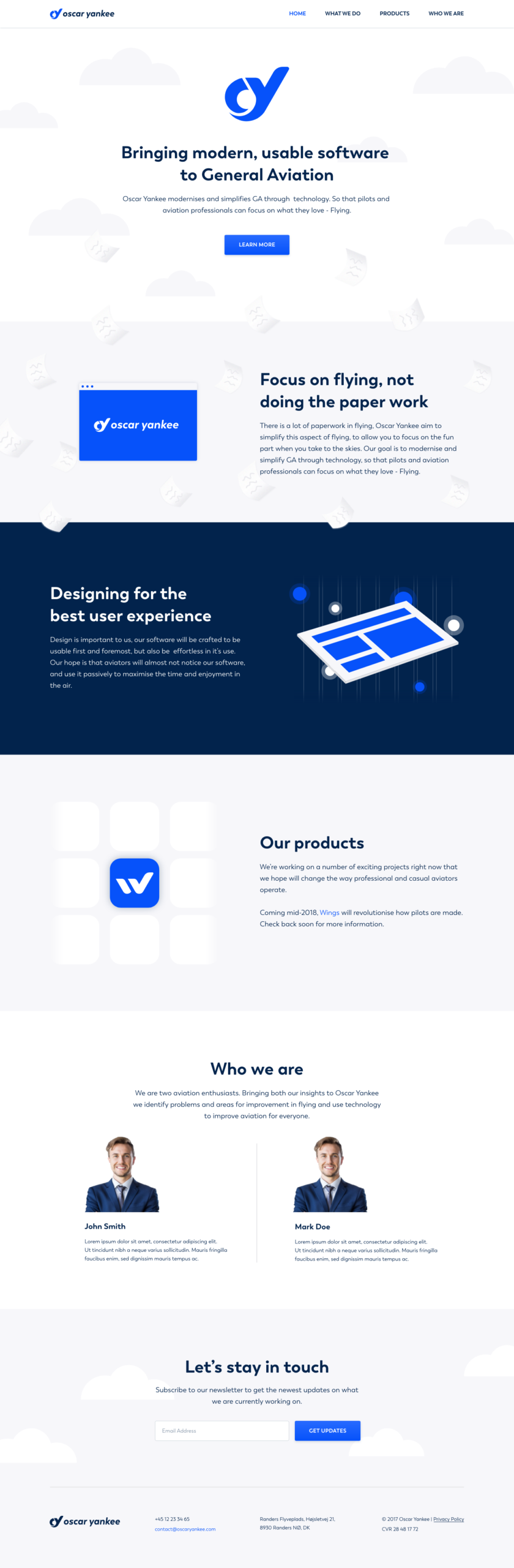
Oscar Yankee is a company creating software for general aviation. With its first flagship product, Wings, the company wants to reach flight schools and help the instructors and students in their learning journey. My task was to create a visual identity for both Oscar Yankee and its product, Wings, including logo, branding, and website design.
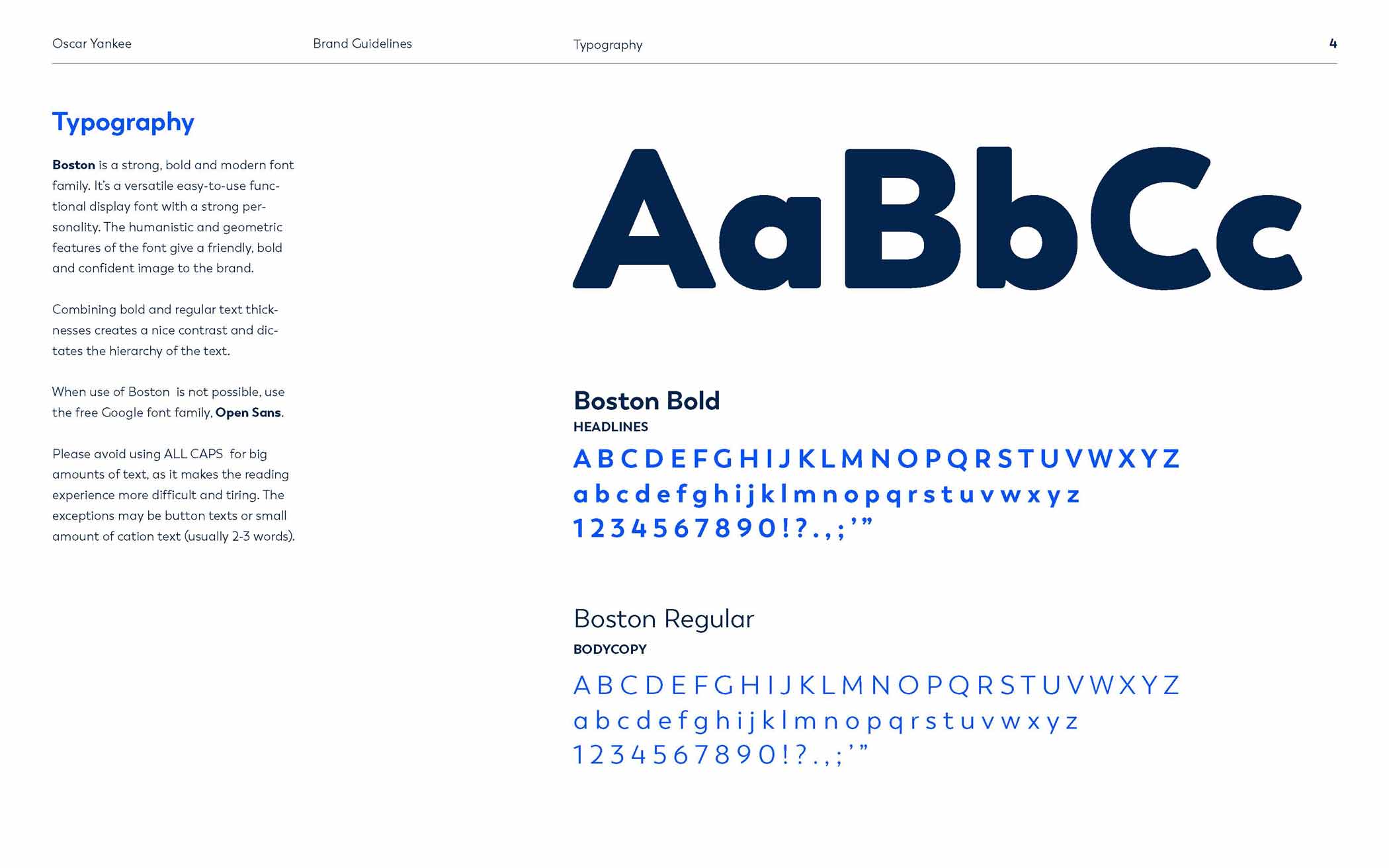
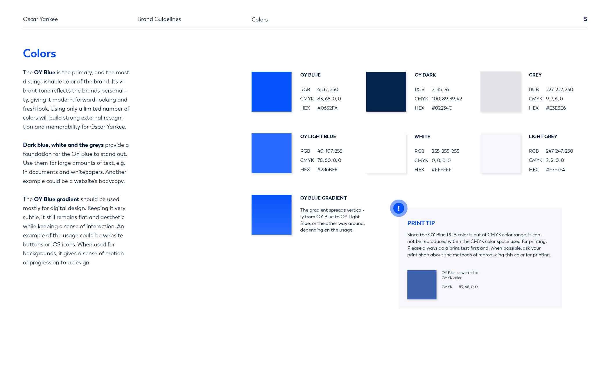
Aerodynamic and geometric shapes combined with vibrant blues, neutrals, and soft-edged & geometric typeface reflect the friendly, bold, modern and fresh image of the brand. All of that combined creates a perfect balance between professionalism and playfulness. I also built both logos using the same base shapes which make the brand more consistent and distinguishable on the market.
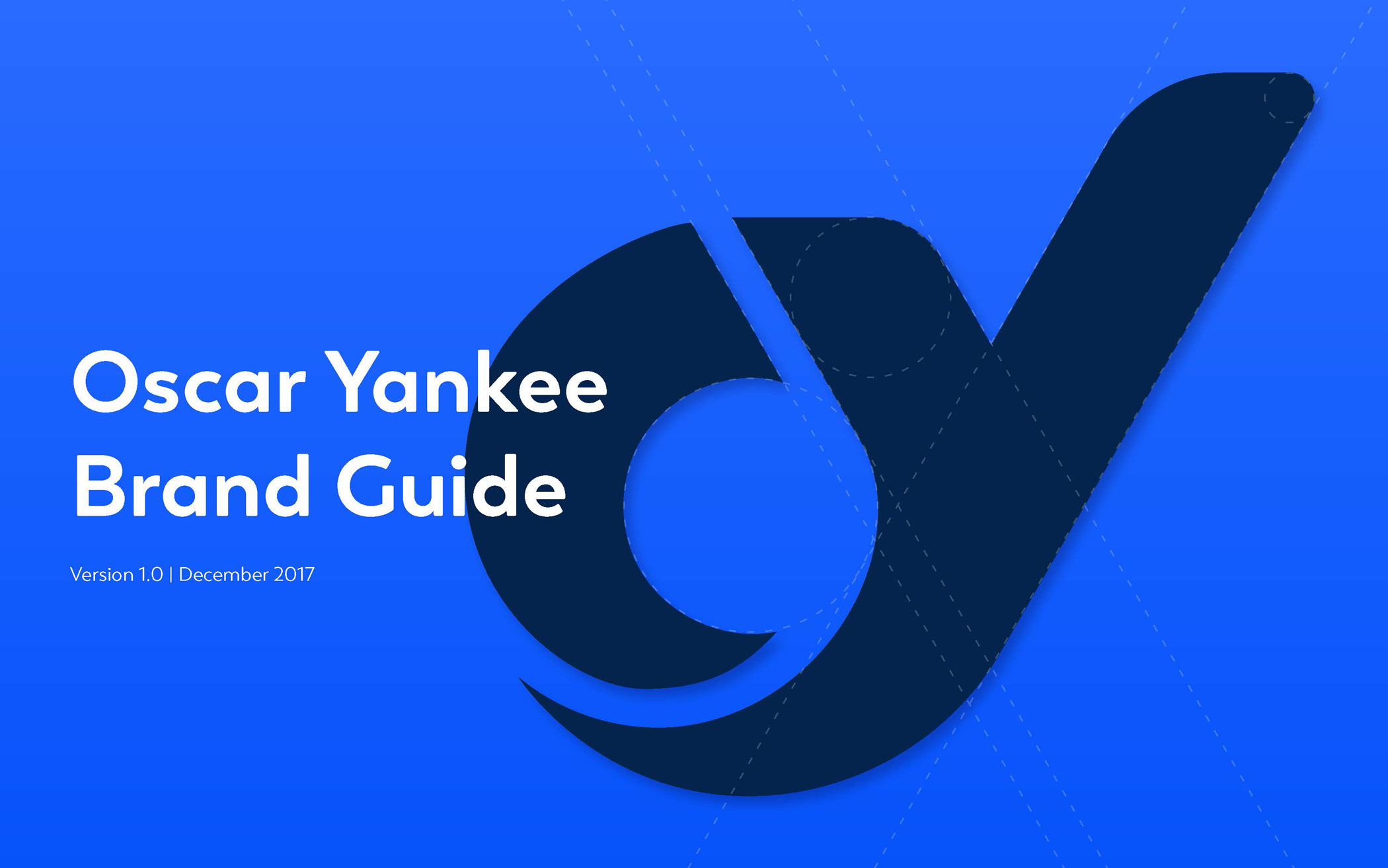
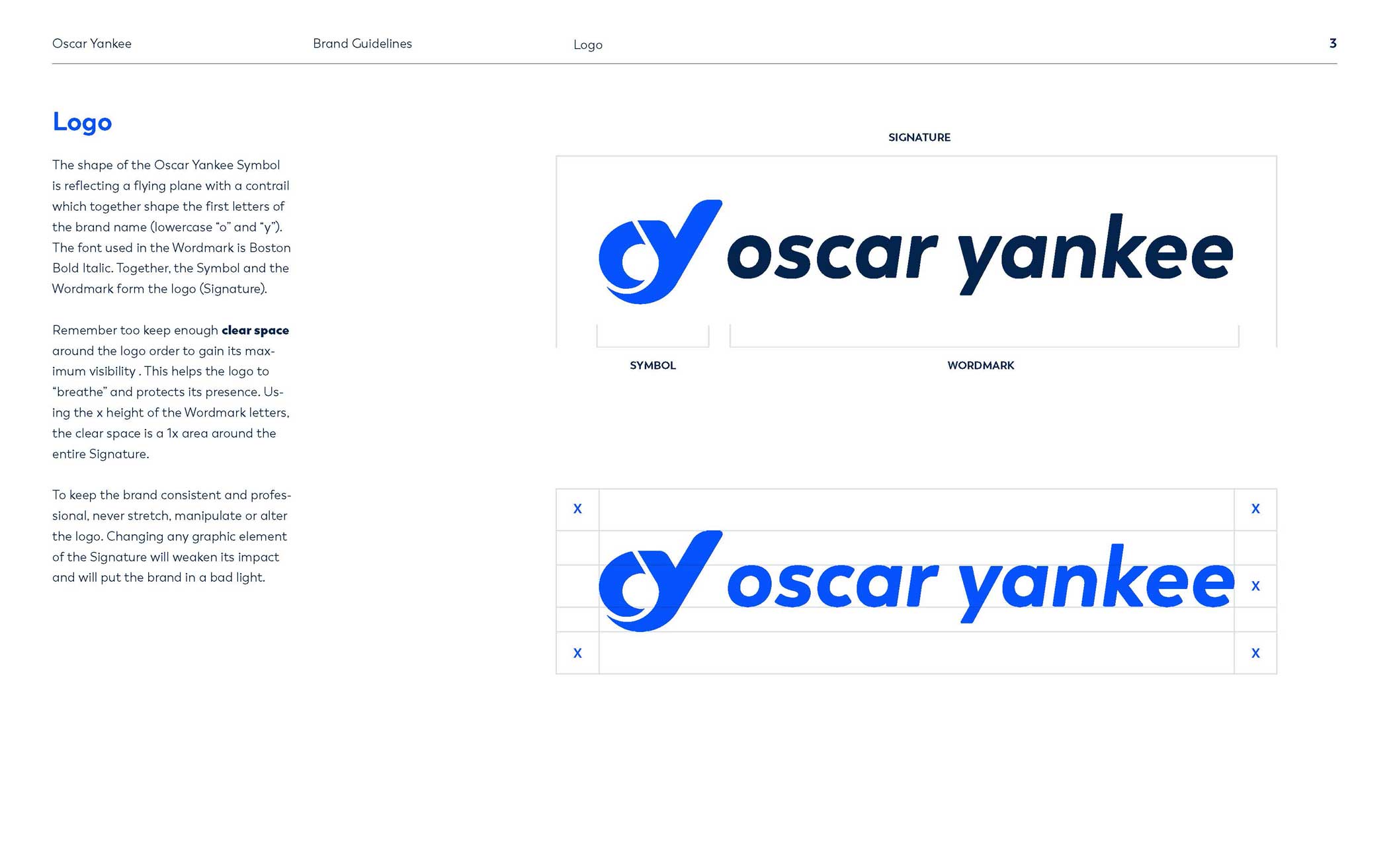
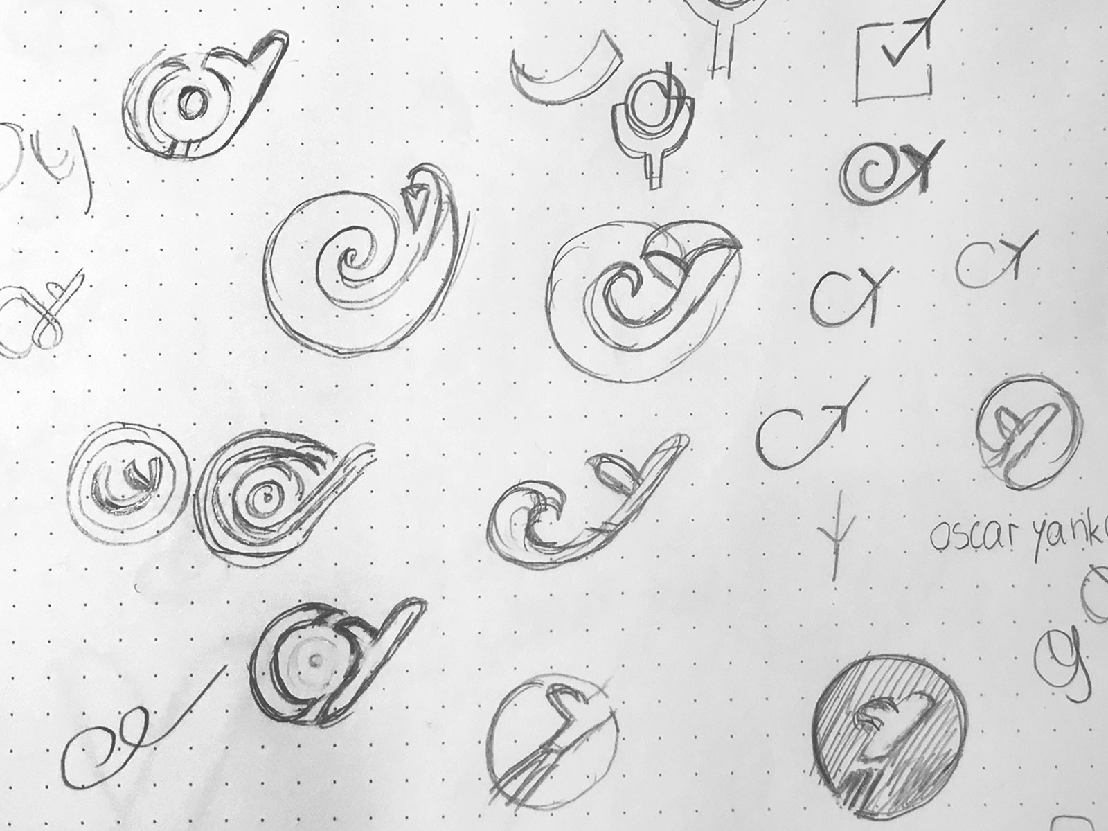
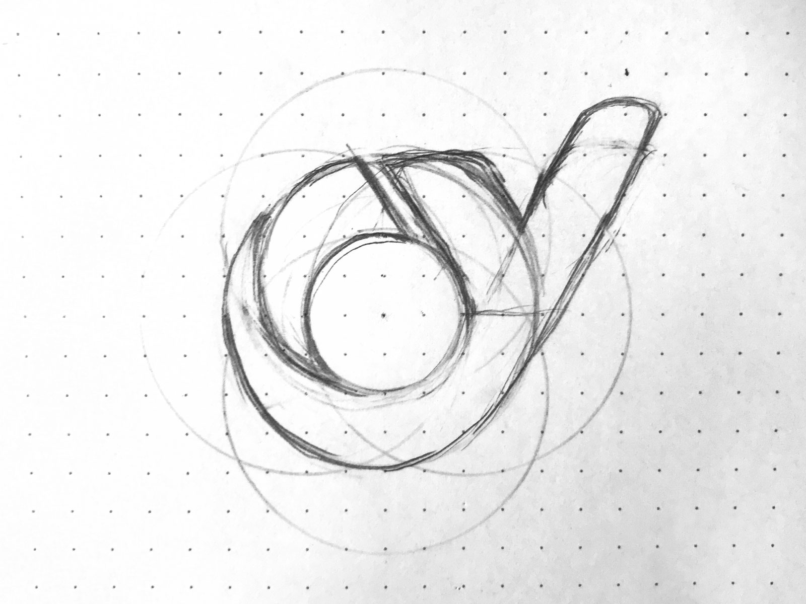
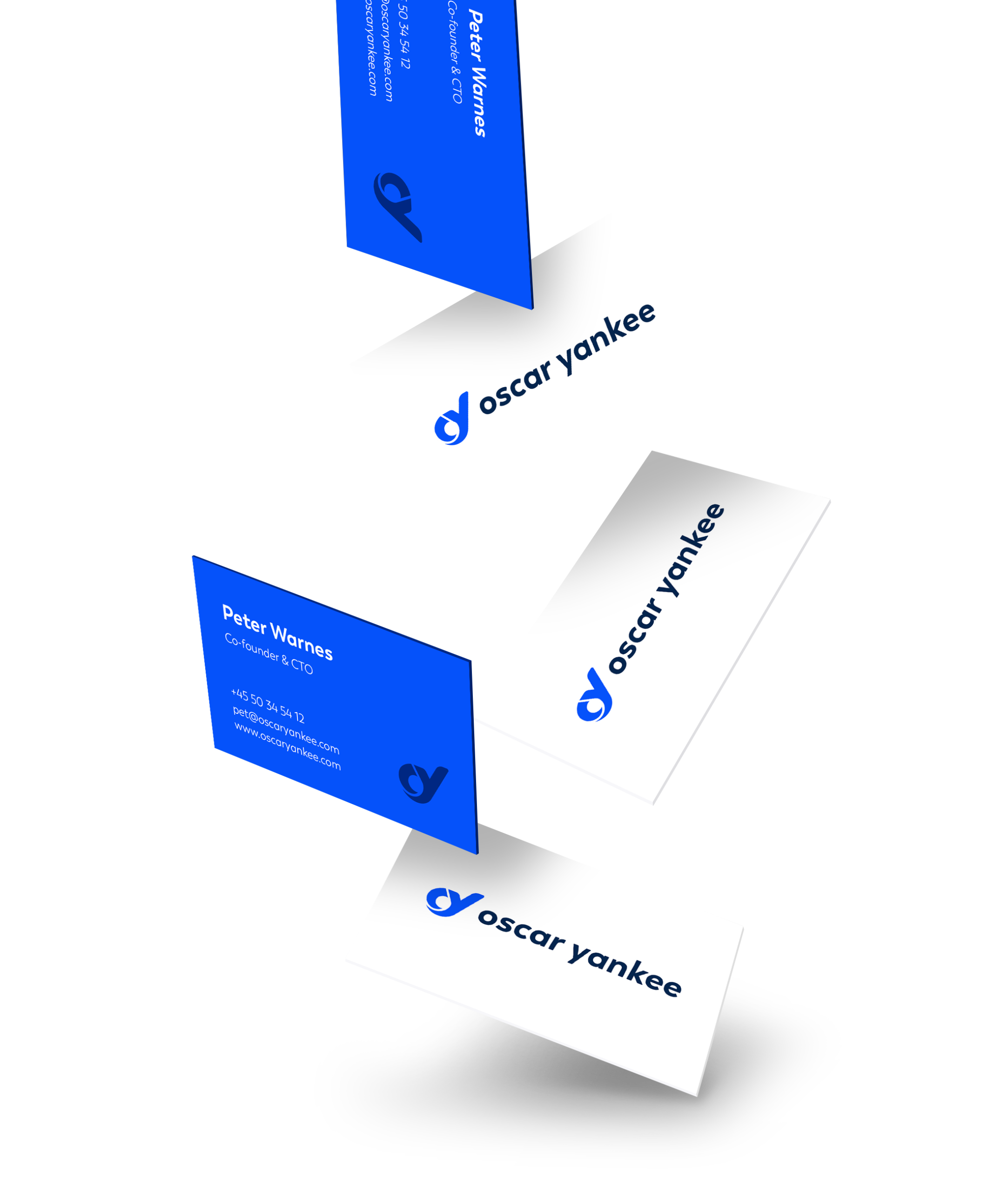
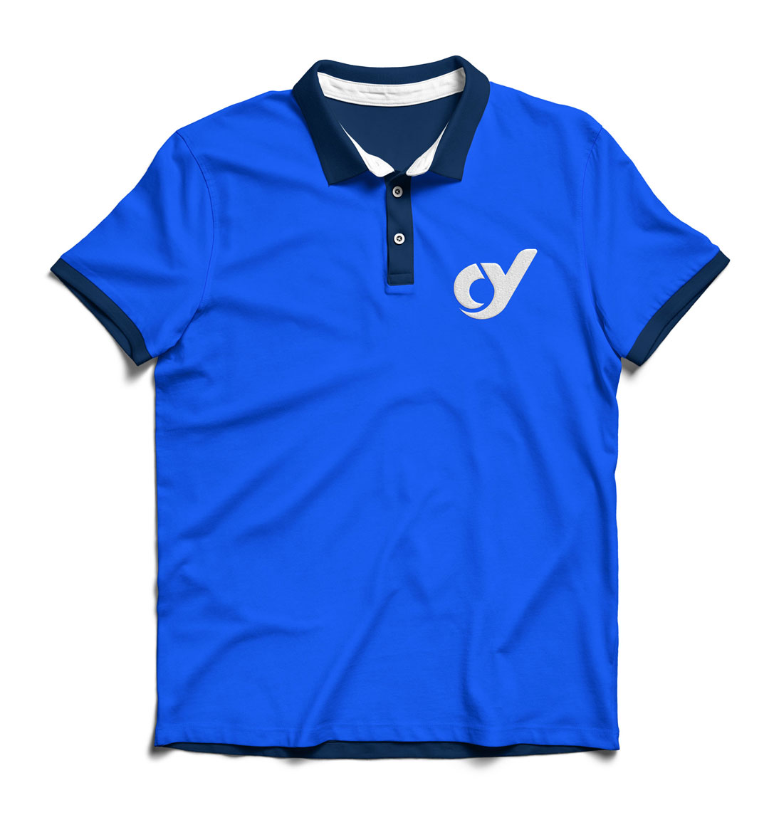
The shape of the final Oscar Yankee Symbol is reflecting a flying plane with a contrail which together form the first letters of the company name.
The shape of the final Oscar Yankee Symbol is reflecting a flying plane with a contrail which together form the first letters of the company name.
The shape of the final Oscar Yankee Symbol is reflecting a flying plane with a contrail which together form the first letters of the company name.
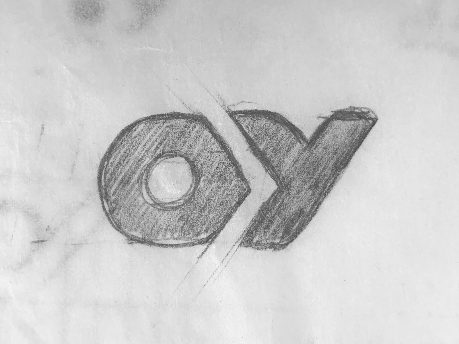
During the logo development, many of my sketches turned into paper planes. It required going back and forth with a few ideas and getting plenty of feedback from the client. This process helped me explore potential branding directions and in the end, decide on the final logo.
During the logo development, many of my sketches turned into paper planes. It required going back and forth with a few ideas and getting plenty of feedback from the client. This process helped me explore potential branding directions and in the end, decide on the final logo.
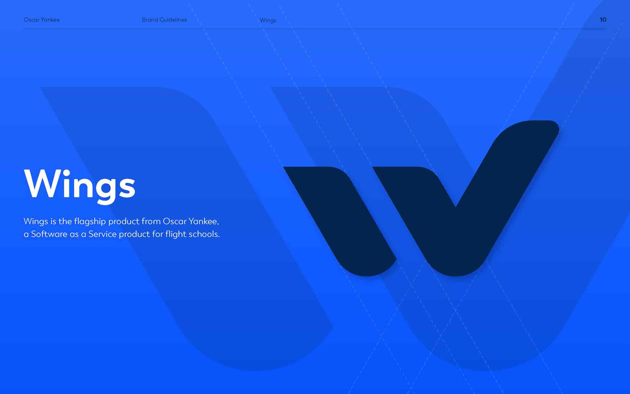
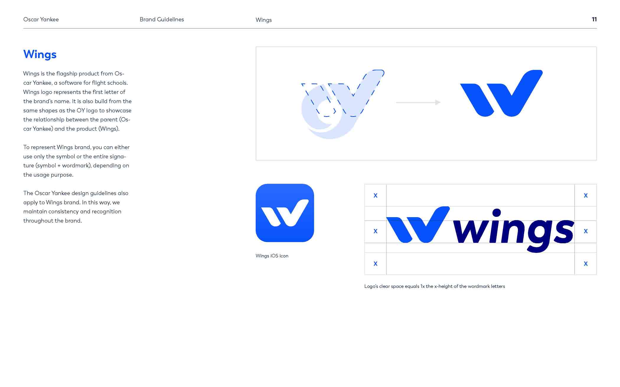
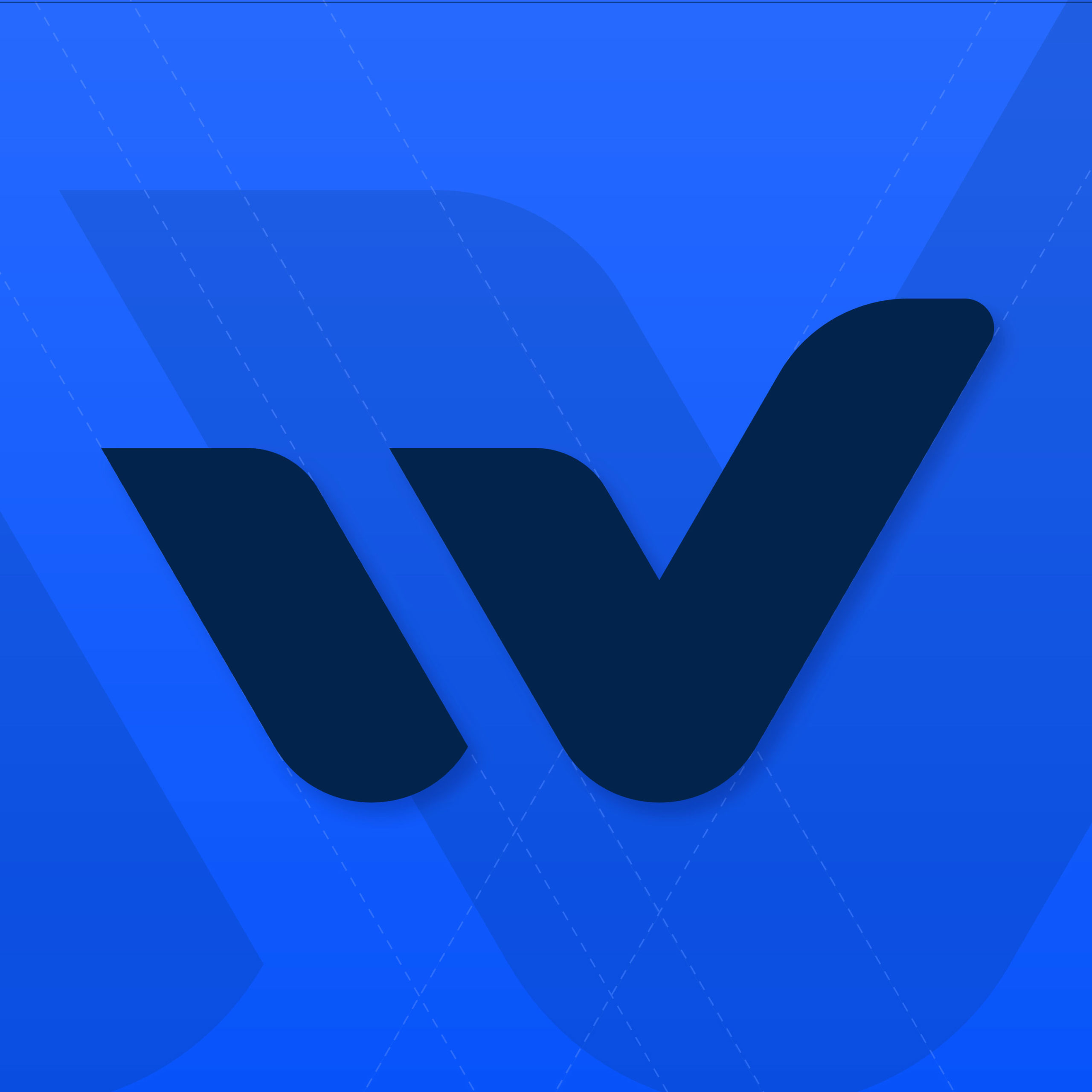
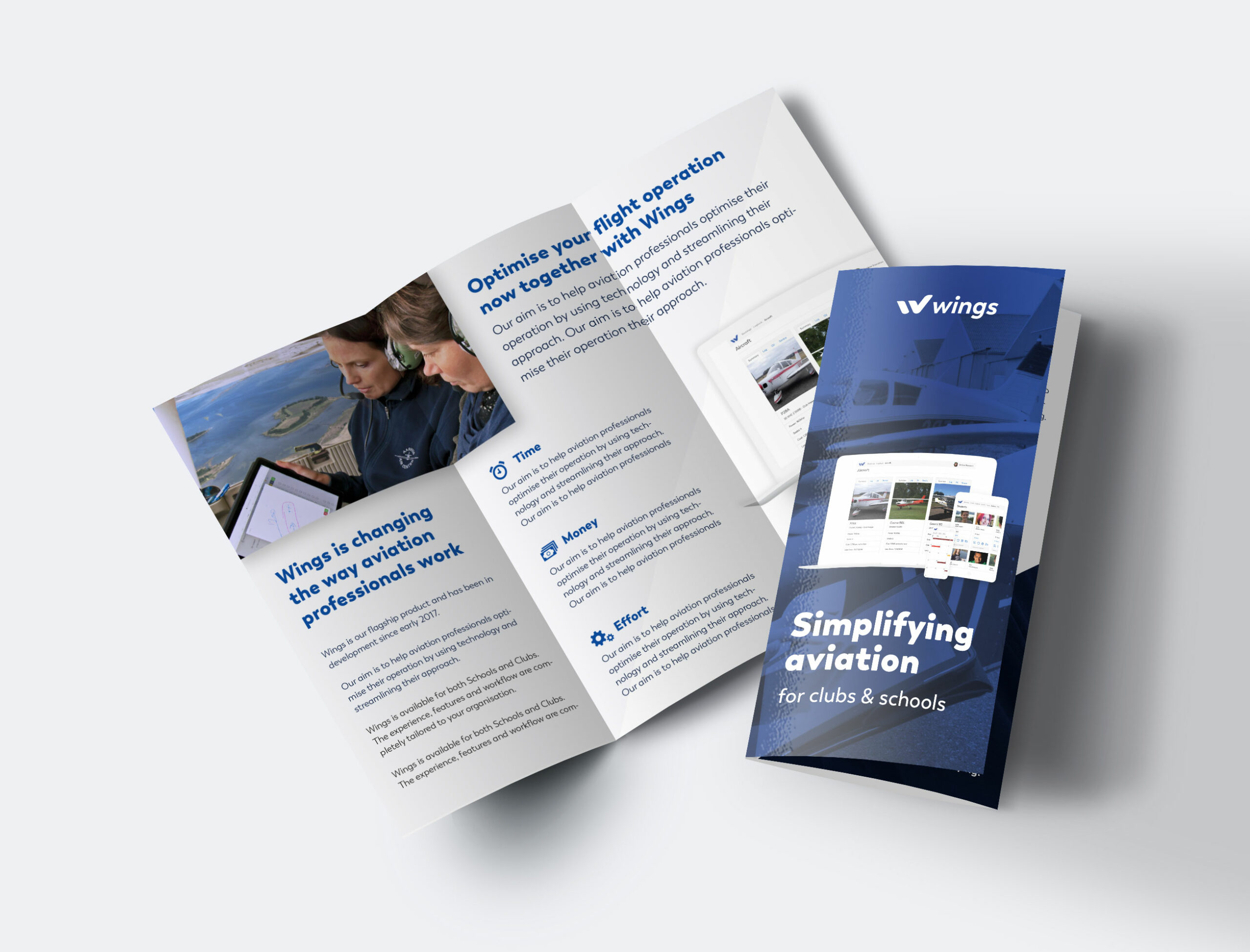
Connecting the aerodynamic shape resembling aviation used in Oscar Yankee logo with a checkmark sign associated with tasks and school and making it look like a letter “W” perfectly reflects the meaning of Wings in a simple, clear and easy to remember logomark.
Connecting the aerodynamic shape resembling aviation used in Oscar Yankee logo with a checkmark sign associated with tasks and school and making it look like a letter “W” perfectly reflects the meaning of Wings in a simple, clear and easy to remember logomark.


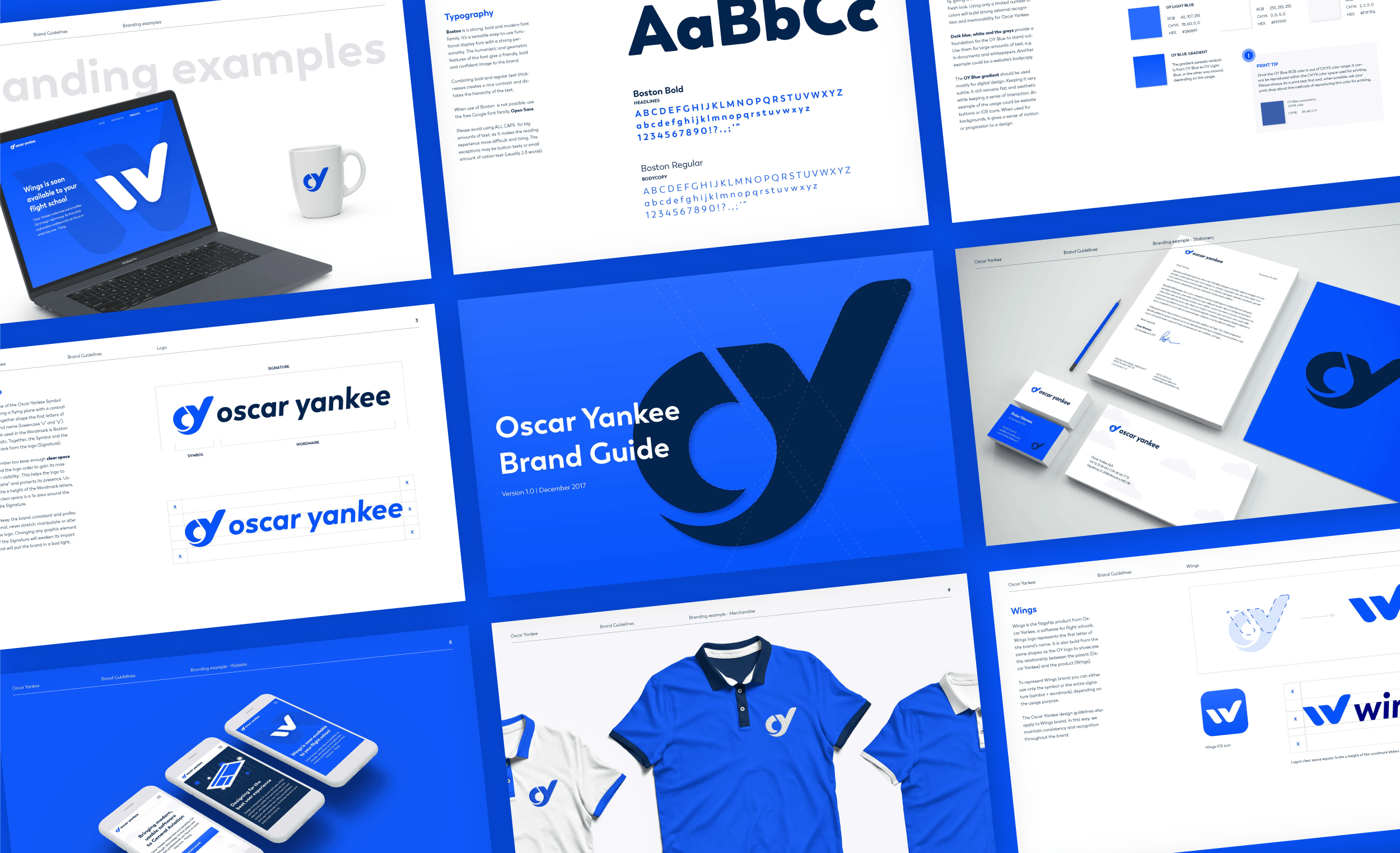
To keep everyone on the same page I gathered the most important design decisions and put them together into one document, the brand guide.
To keep everyone on the same page I gathered the most important design decisions and put them together into one document, the brand guide.