Discover Tenerife – redesigning the digital experience
Webtenerife.com is a website promoting Tenerife's tourism. I had the opportunity to work on a winning tender on improving its user experience and making it more engaging and attractive for the visitors.
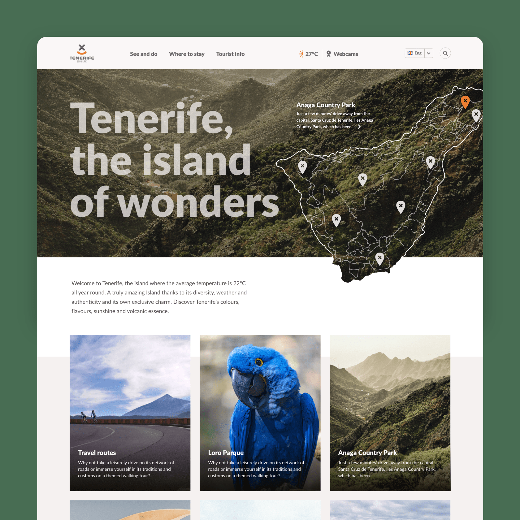
With the new design I tried to portray the destination’s personality while letting the visitors immerse into the website and get inspired and excited about their future trip. The goal was to make the website more informational and serve as a guidebook for a potential tourist.
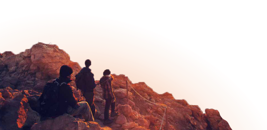
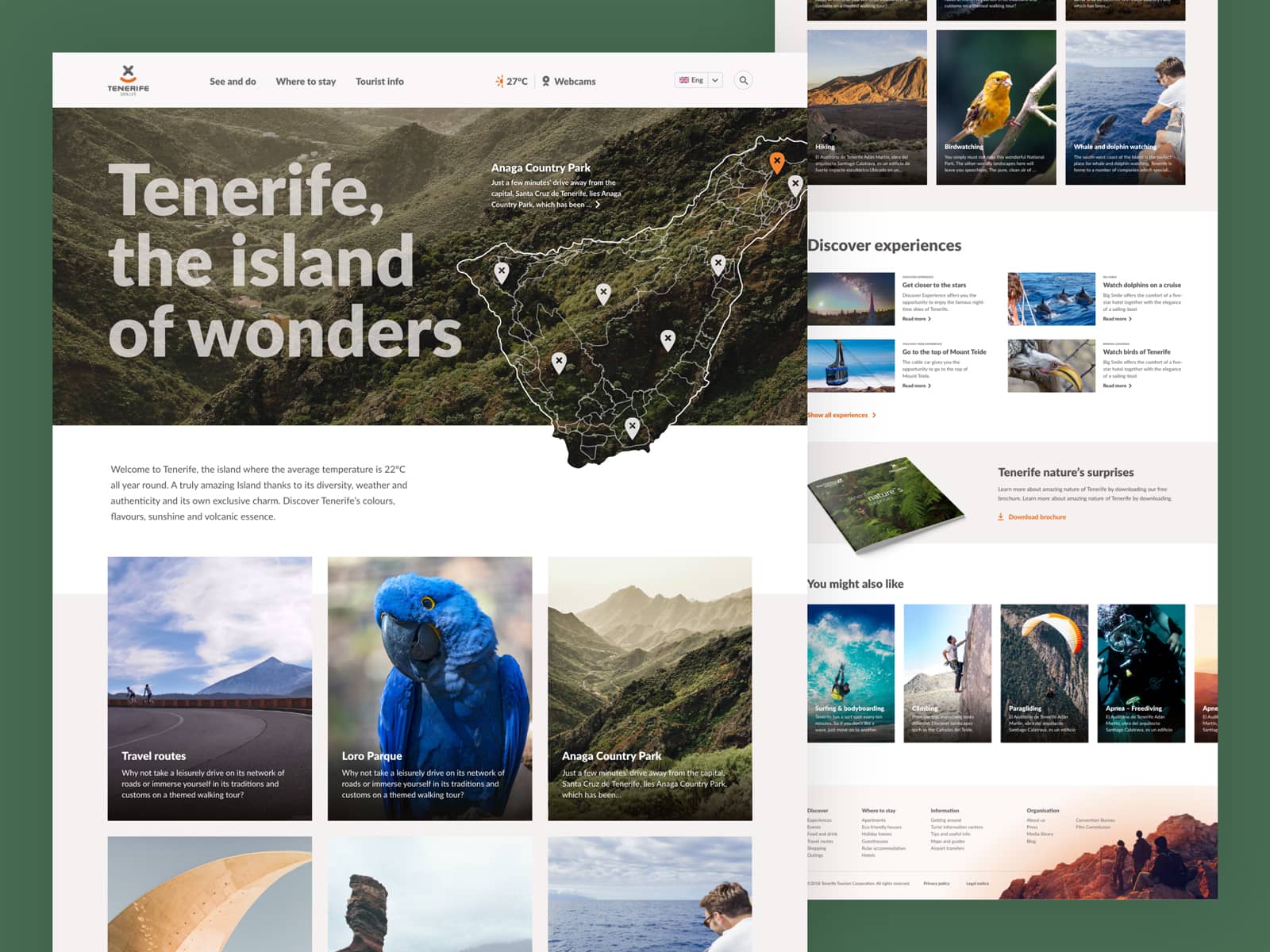
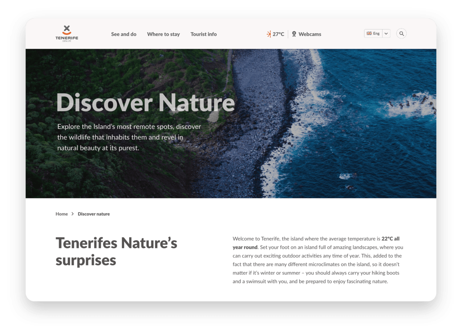
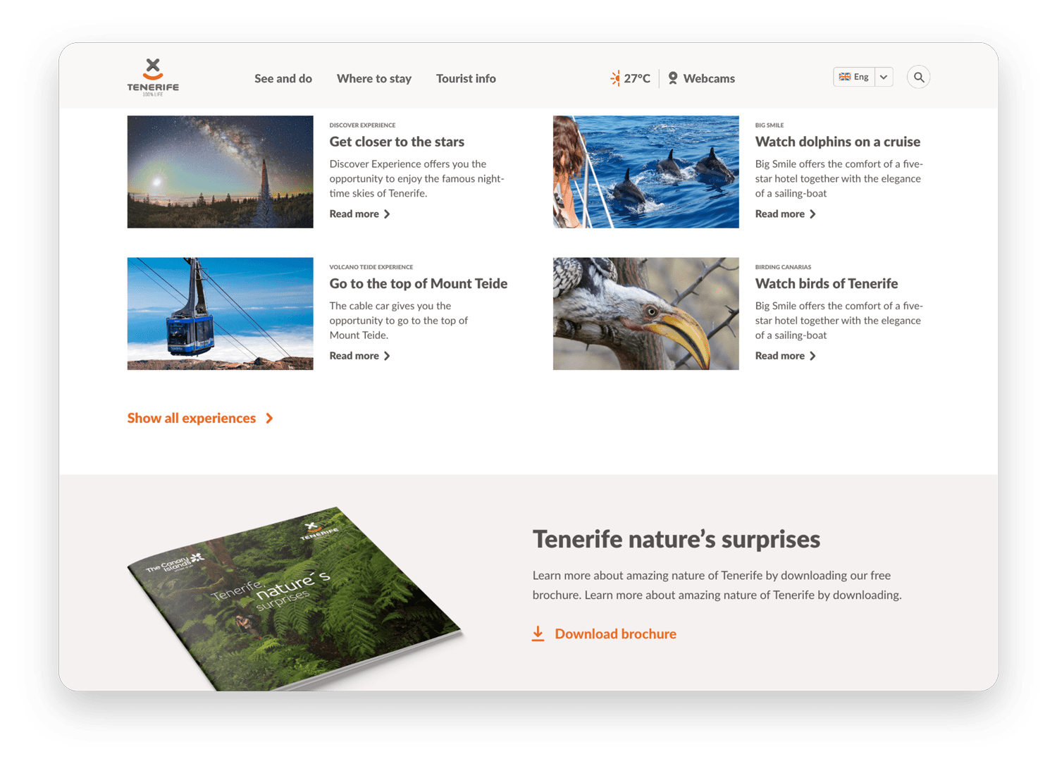
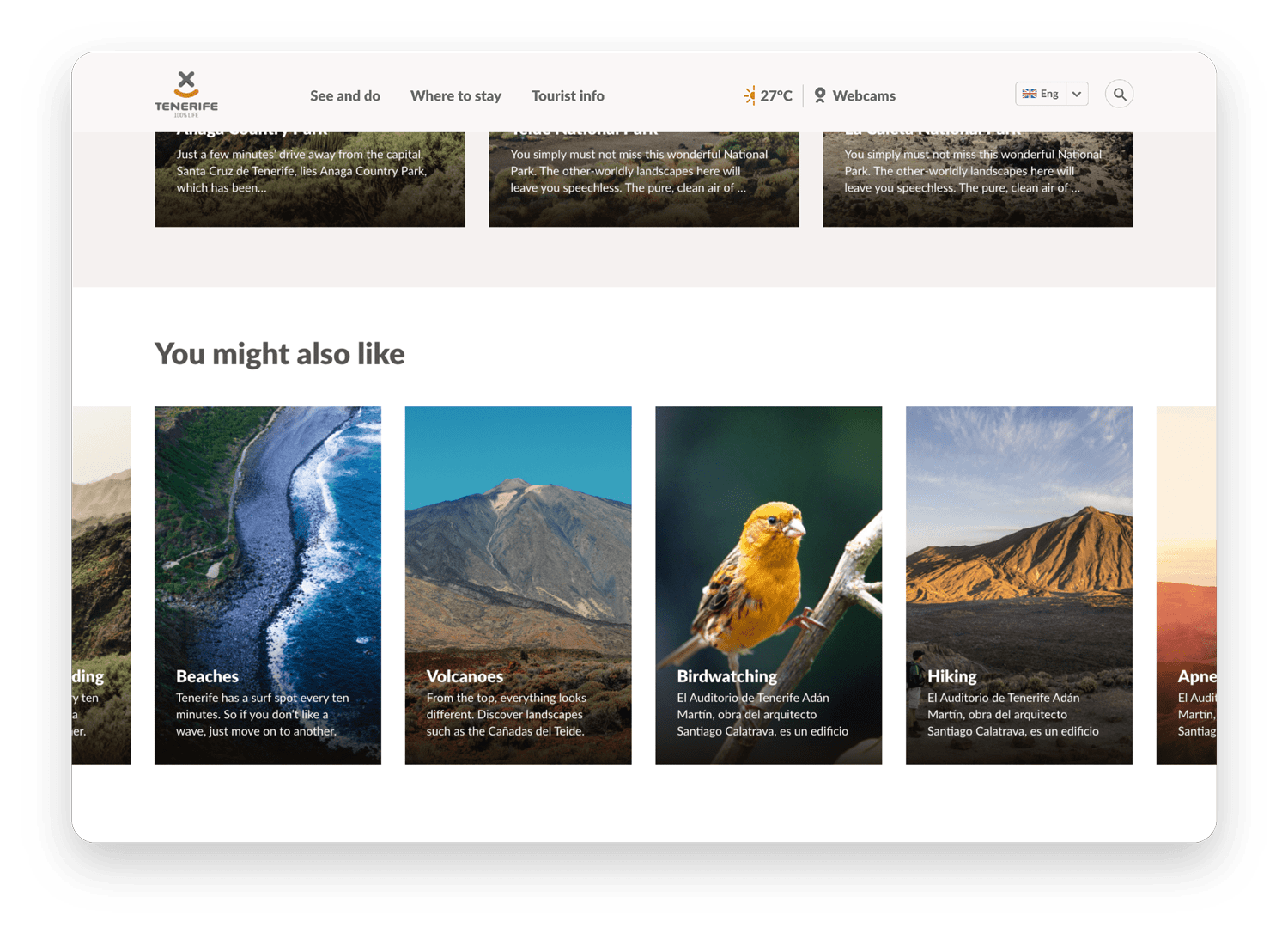
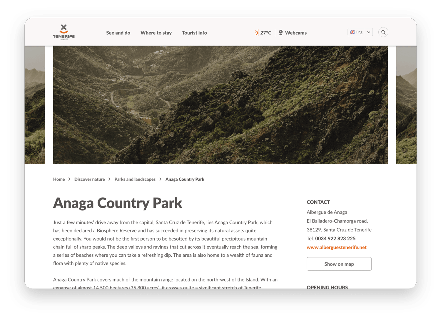
Attractive, big images take most of the space on almost every page of the site. This together with a lot of whitespace and clear, bold typography creates a unique and attractive image of Tenerife making the potential visitor inspired and emerged into the country even before visiting it.
Warm neutral colours with a splash of orange relate to warm summer weather and give out a friendly feel. Also, the appearance of elements such as map pins or arrows reflects the soft shapes of the logo, thus making the brand experience more coherent.
Attractive, big images take most of the space on almost every page of the site. This together with a lot of whitespace and clear, bold typography creates a unique and attractive image of Tenerife making the potential visitor inspired and emerged into the country even before visiting it.
Warm neutral colours with a splash of orange relate to warm summer weather and give out a friendly feel. Also, the appearance of elements such as map pins or arrows reflect the soft shapes of the logo, thus making the brand experience more coherent.
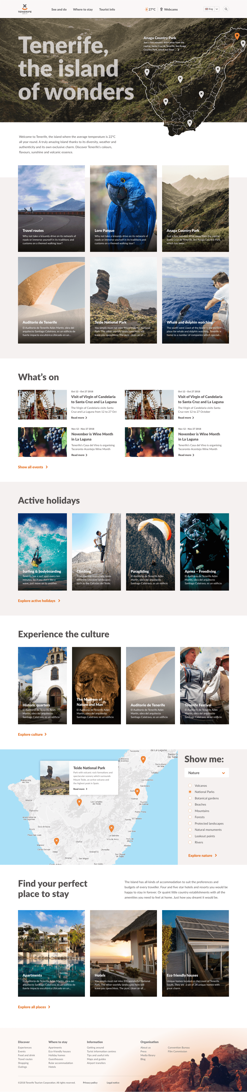
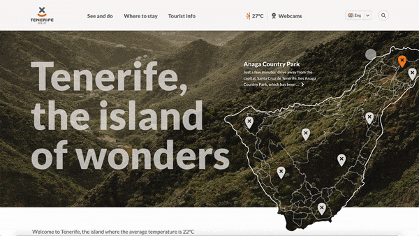
There are a few interactive elements that make the website more engaging and encouraging to explore. One of them is a map that enables the visitor to click between the most popular attractions of Tenerife, see their location on the map, and, at the same time, get immersed thanks to the beautiful imagery. The user can also read a small paragraph about a particular attraction and easily go to its subpage straight from the homepage.
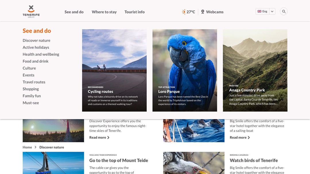
The mega menu enables the visitor to get a clear overview and easier access to different subpages. The picturesque thumbnails linking to recommended attractions encourage the visitor to explore the website. Those could also be customised to match each user's needs or the company's business objectives.
The mega menu enables the visitor to get a clear overview and easier access to different subpages. The picturesque thumbnails linking to recommended attractions encourage the visitor to explore the website. Those could also be customised to match each user's needs or the company's business objectives.