Branding & designing an automotive industry app
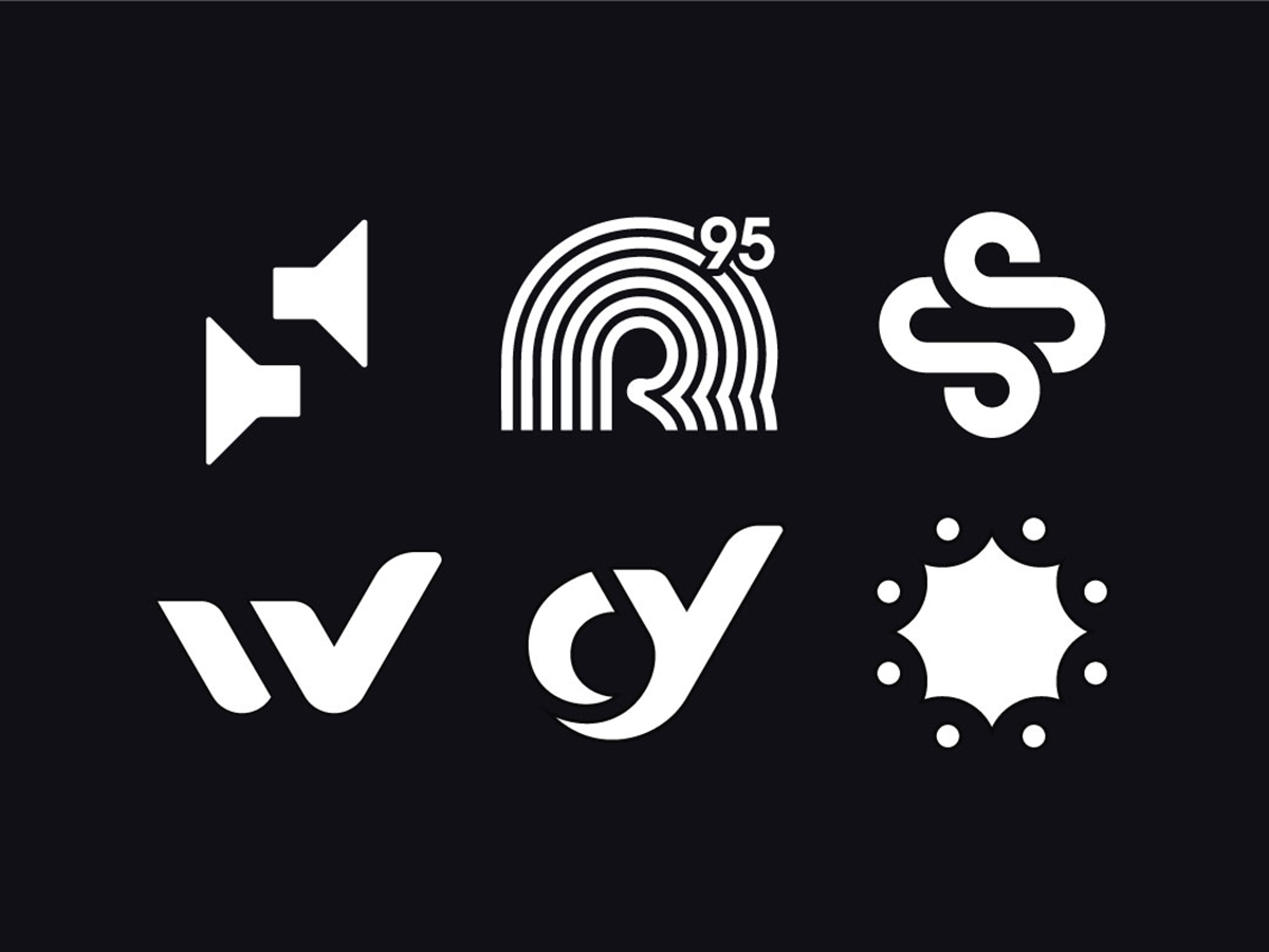
Logo design for a freelancer specialising
in high-quality audio production
Logo design for a freelancer specialising in high-quality audio production
Logo design for a freelancer specialising in high-quality
audio production
Branding & designing an automotive industry app
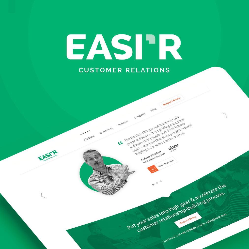
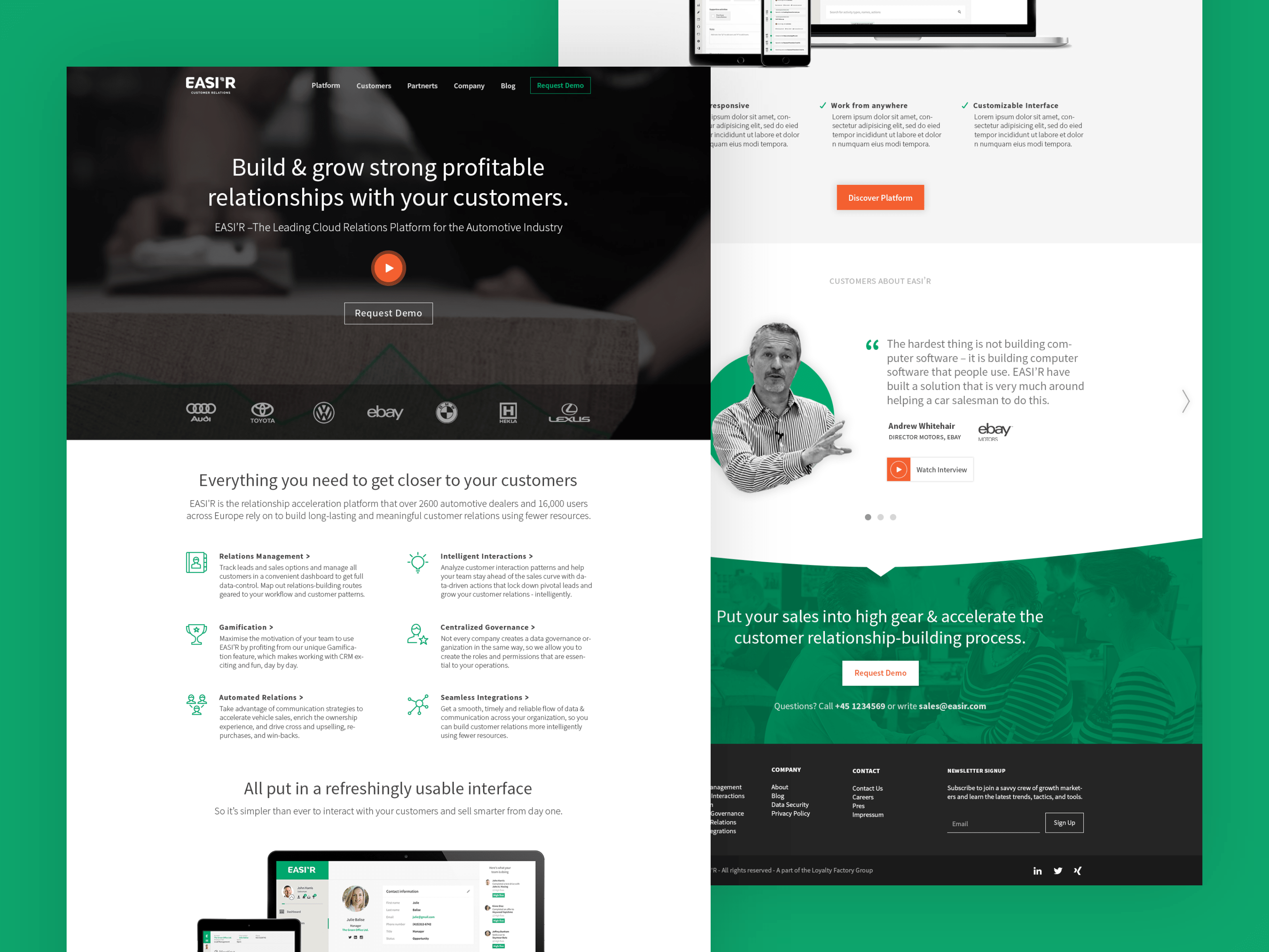
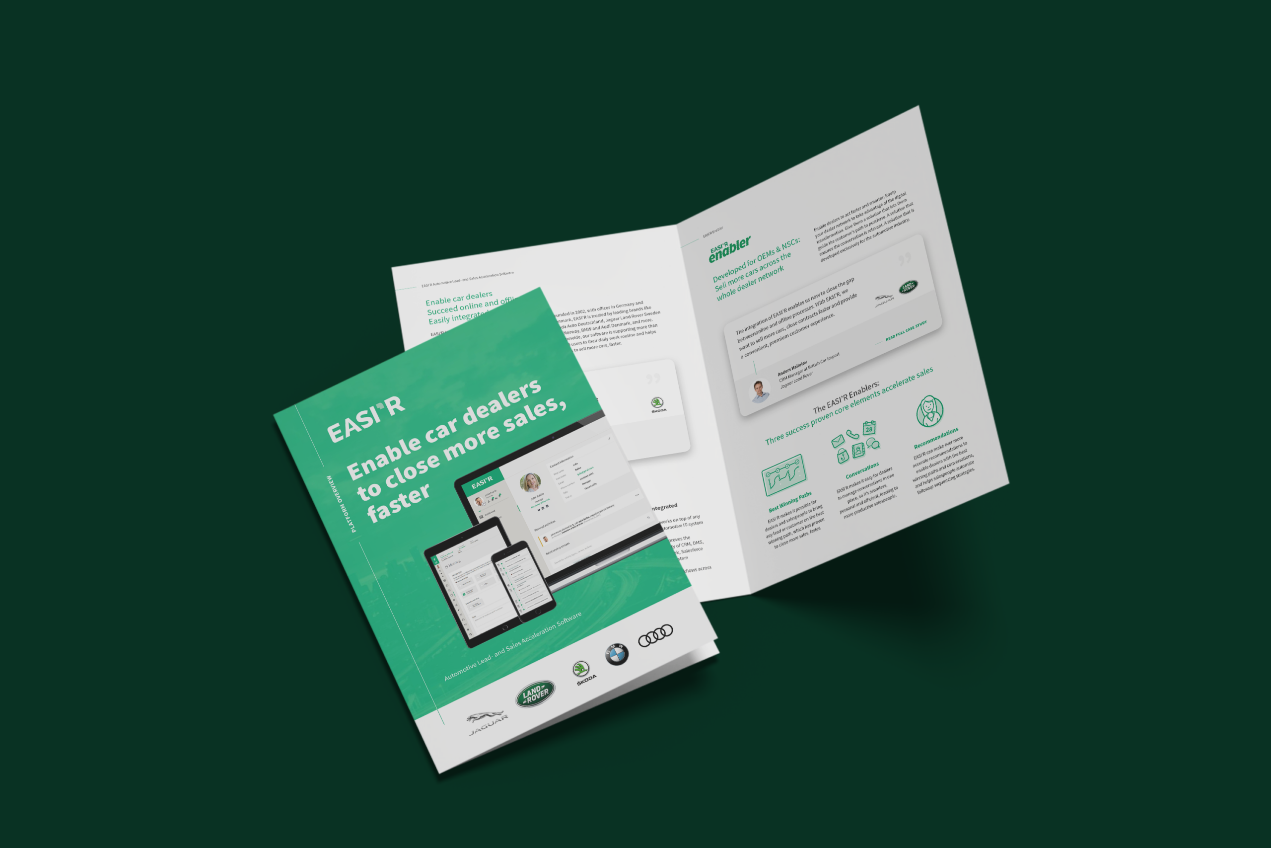
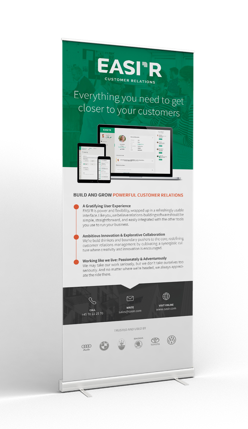
EASI’R is the leading cloud relations platform for the automotive industry. The company helps car dealerships build and grow profitable customer relations.
My adventure with EASI'R began in 2015 as an intern at first, before I got hired as a part-time graphic designer. I was responsible for redesigning the company's website, as well as developing and maintaining the new visual identity of the brand. I worked closely with the marketing department on different kinds of tasks, such as creating newsletter templates, designing stationery and variety of marketing templates. I also had an input on designing the user interface of the platform itself as a UI designer.
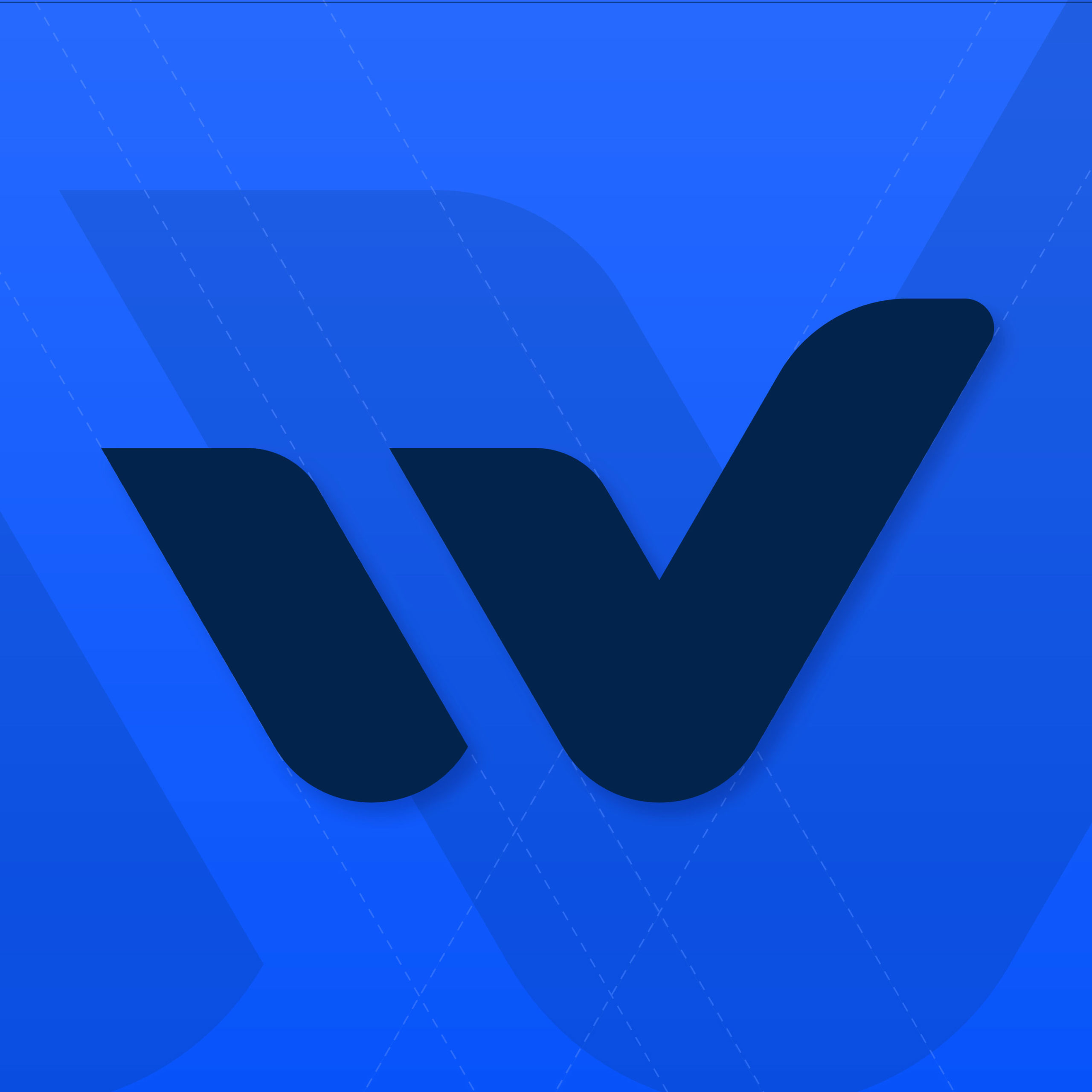
Sound Manning (Seán Manning), is a freelancer specialising in audio production and podcast editing. His personal brand is sharp, modern, and fresh, and focuses on producing high-quality content with strong emphasis on technical details.
I decided to combine speaker symbols with the letter S into a strong and minimal logomark. A simple animation better visualises the concept and adds personality to the brand while making it even more memorable. The animation could also be used as an intro to Seán's project videos. ⠀
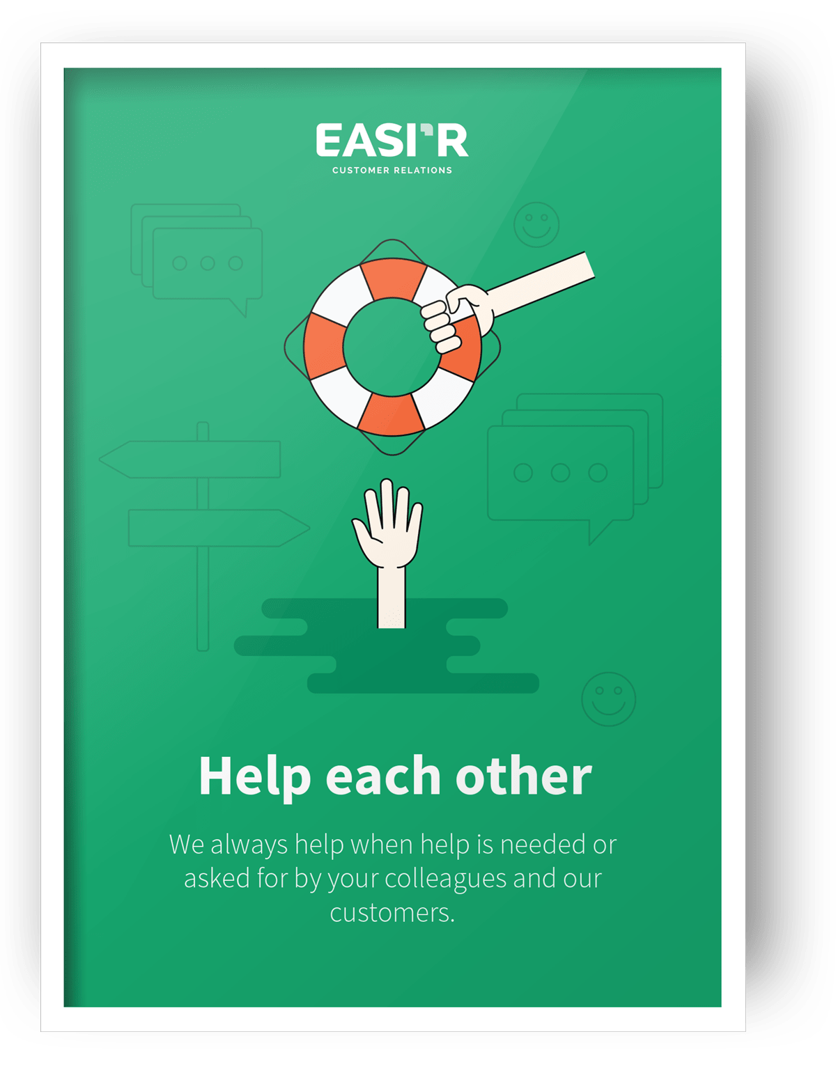
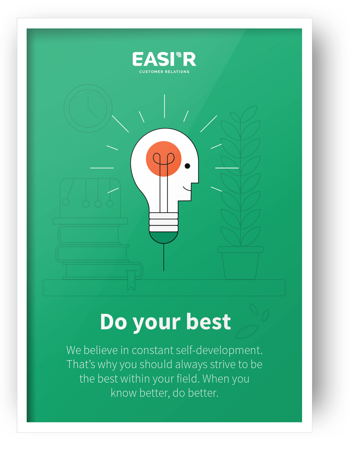
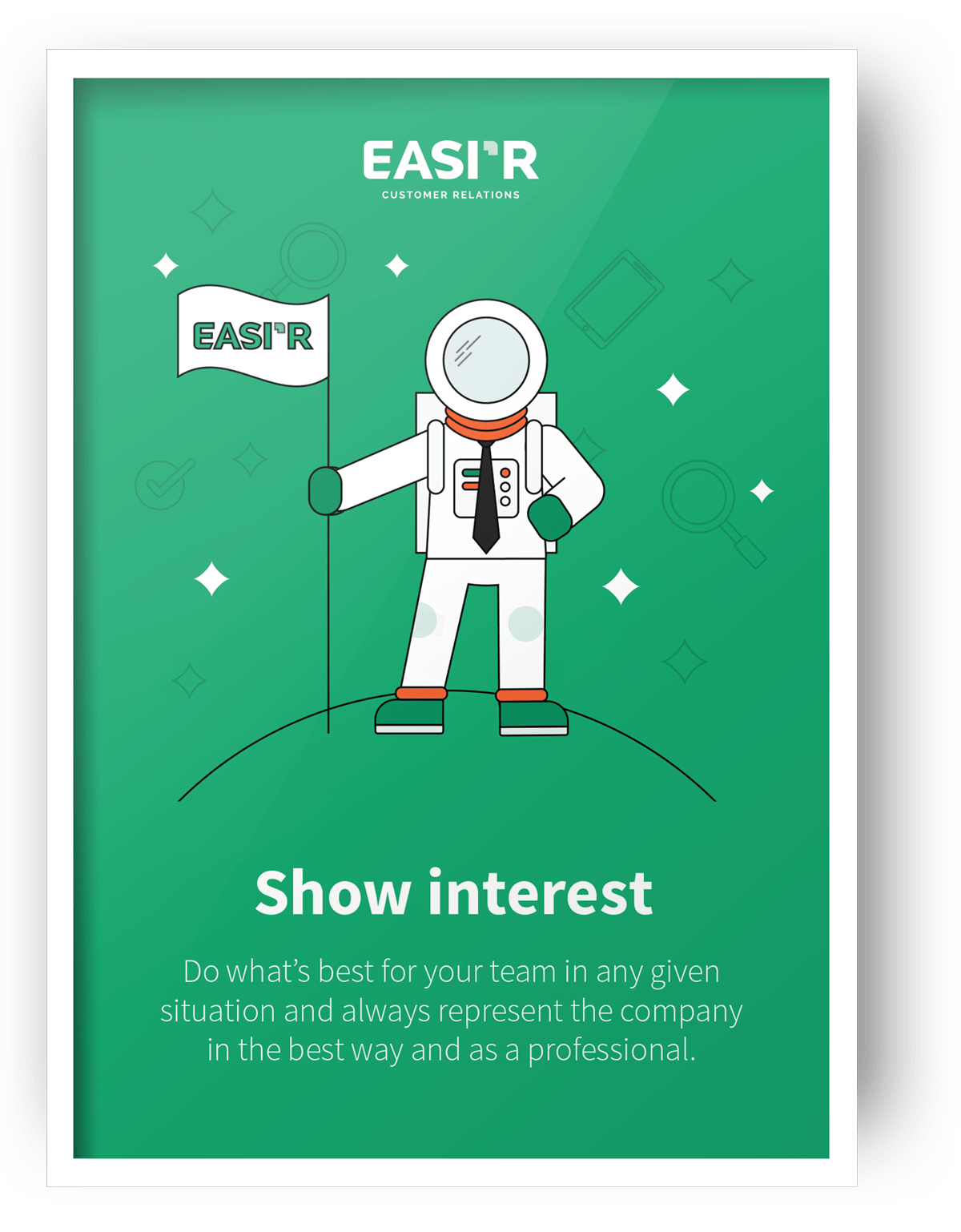
One of my tasks was to design a set of posters representing the company values. Having been given the creative freedom, I made illustrations representing each of the values while sustaining the look and feel of the brand.
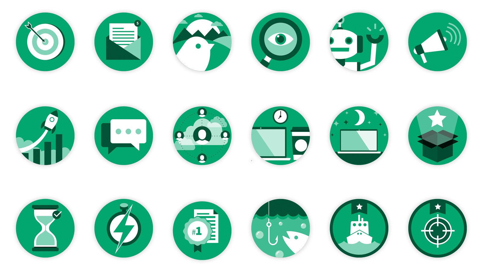
Another big project was designing a set of achievement badges as a part of the gamification feature of the platform. You could unlock a specific badge by being an active software user.
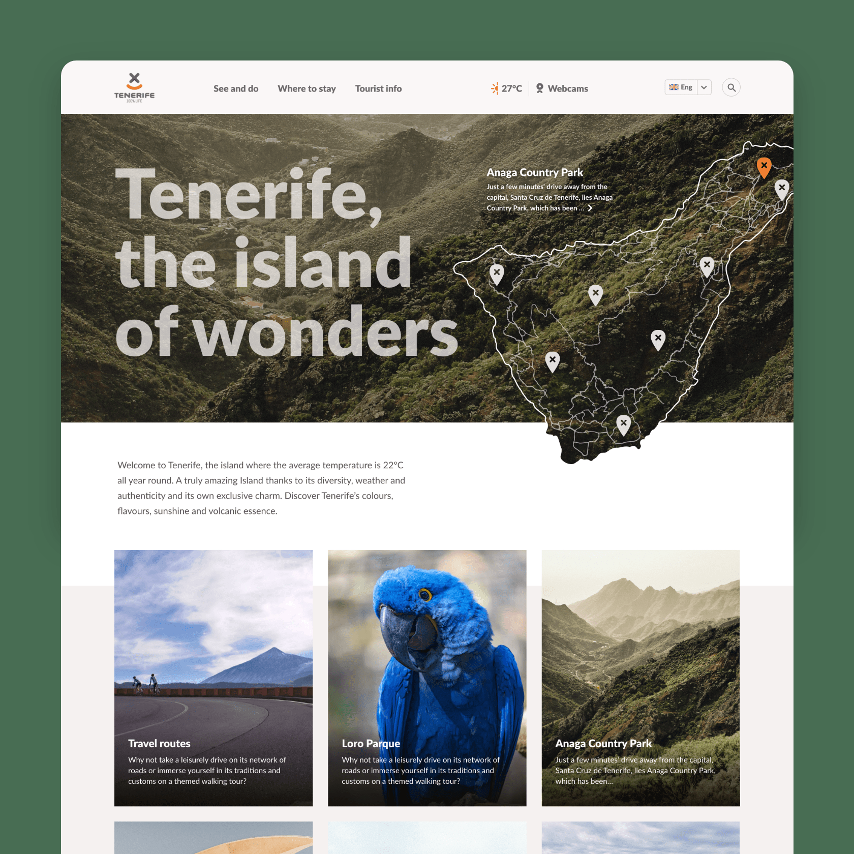
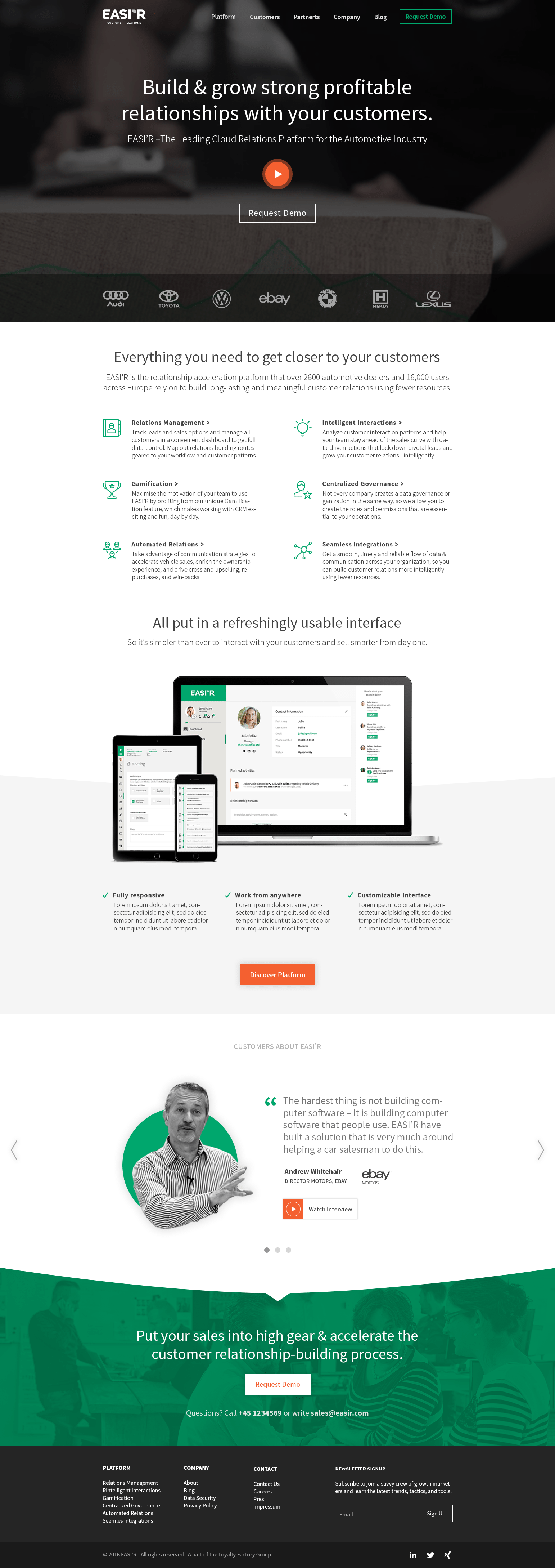
The purpose of the website is to get attention of the potential customers – automotive dealership companies. The website and the image of the company is bold, masculine and professional, yet fresh and modern.
The design is clear and simple, reflecting the “lightness” and freshness of the software. Using sharp shapes (eg. buttons, arrows) and big headlines shows the masculine side of the brand and builds confidence and trust.
The purpose of the website is to get an attention of the potential customers, automotive dealership companies. The website and the image of the company bold, masculine and professional, yet fresh and modern.
The design is clear and simple, reflecting the “lightness” and freshness of the software. Using sharp shapes (eg. buttons, arrows) and big headlines, shows the masculine side of the brand and builds confidence and trust.
The purpose of the website is to get attention of the potential customers – automotive dealership companies. The website and the image of the company is bold, masculine and professional, yet fresh and modern.
The design is clear and simple, reflecting the “lightness” and freshness of the software. Using sharp shapes (eg. buttons, arrows) and big headlines shows the masculine side of the brand and builds confidence and trust.
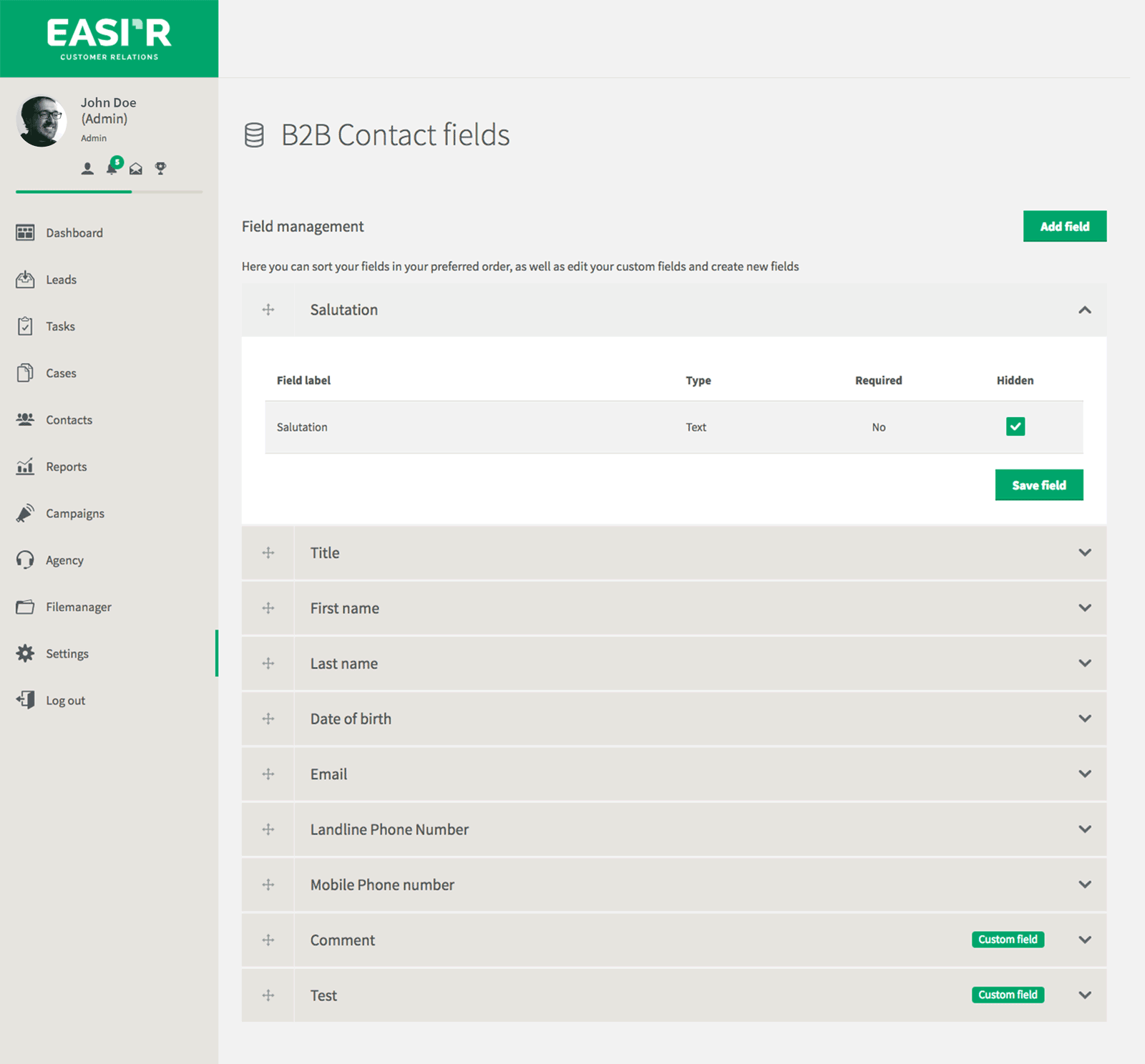
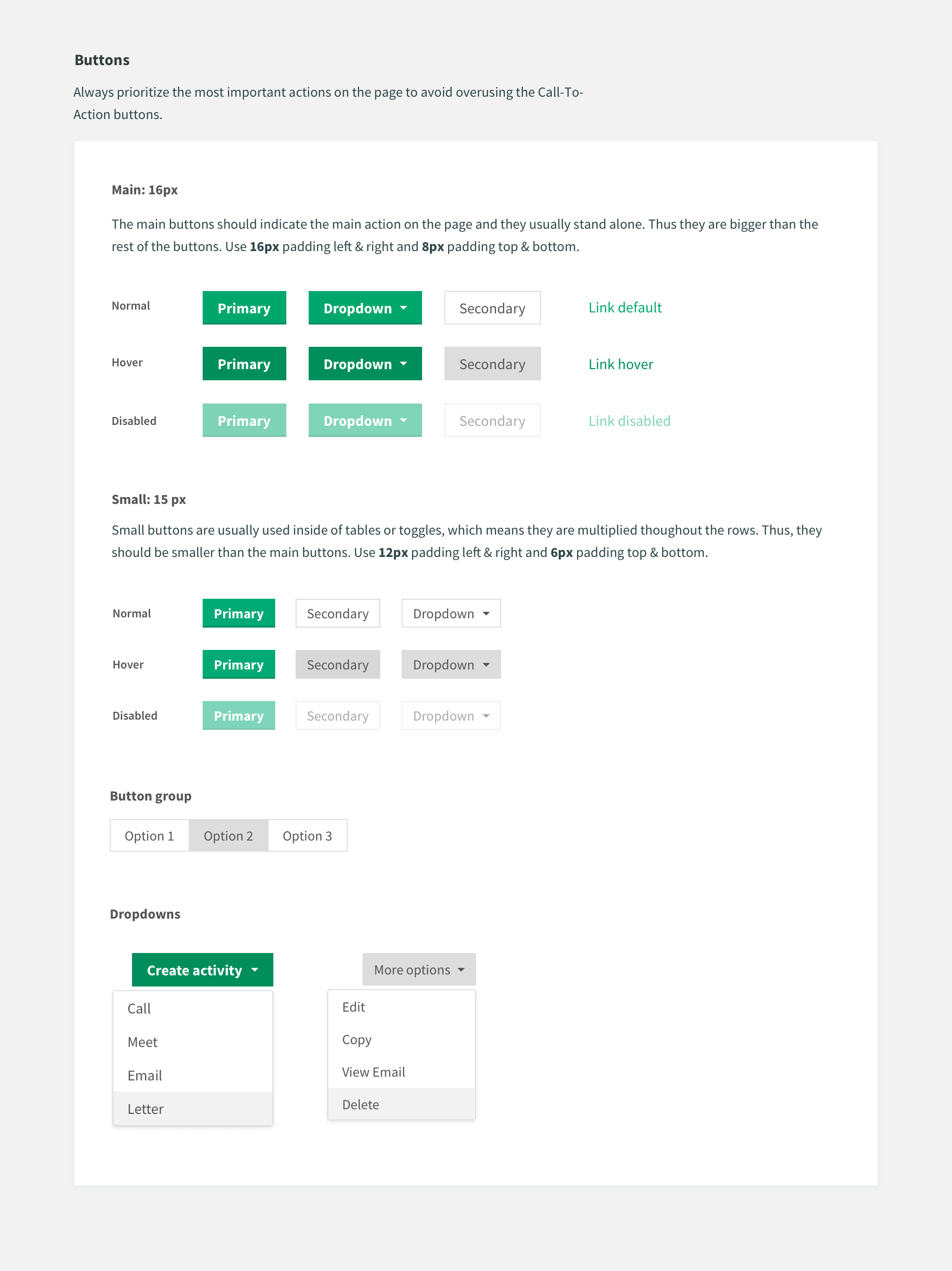
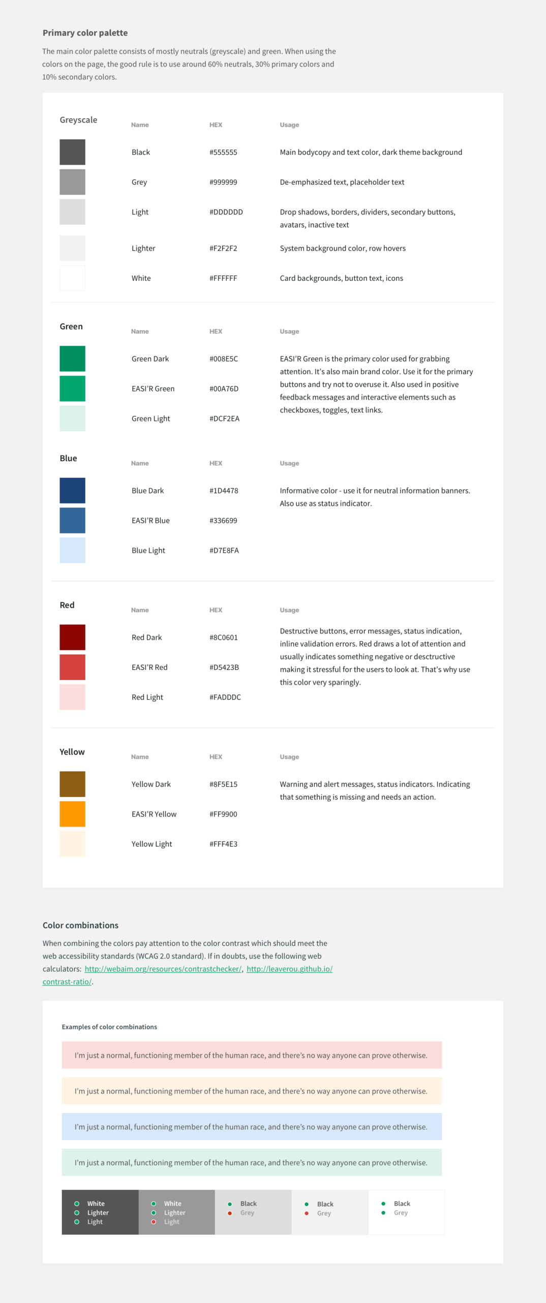
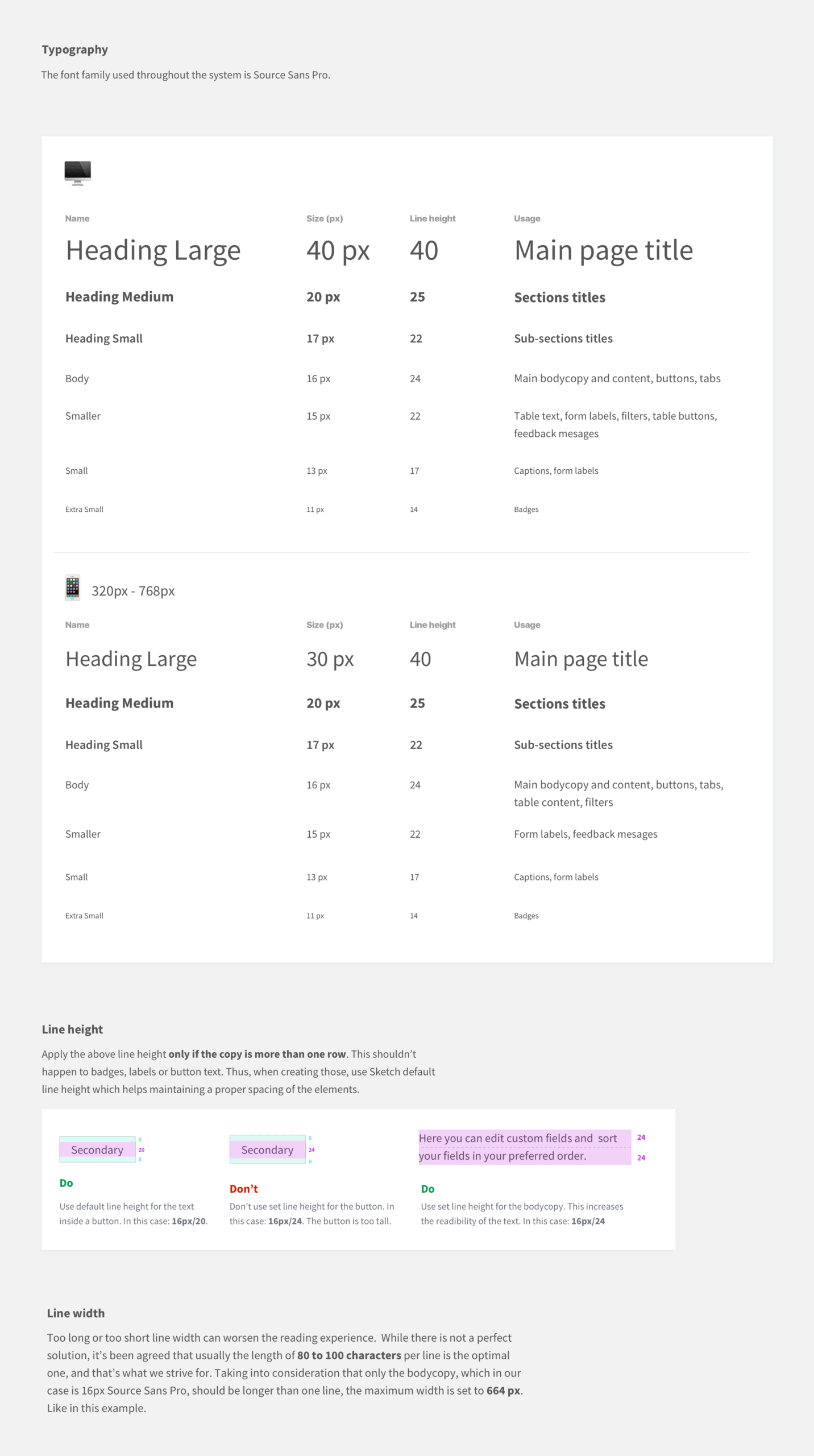
EASI'R has experienced a huge growth over the last few years. Having had no design team before, there were no principles guiding the development team in building the product. This in return resonated with many inconsistencies throughout the system, making the user experience incohesive. All of this led to the conclusion that EASI'R needs to develop a set of principles definig the visual language of the platform.
Conducing the content audit of the existing software helped in spotting the inconsistencies and flaws of the system which then were corrected and unified into the new design guide.