Visual identity for an app teaching kids how to count with money
Visual identity for an app teaching kids how to count with money
Visual identity for an app teaching kids how to count with money
Visual identity for an app teaching kids how to count with money
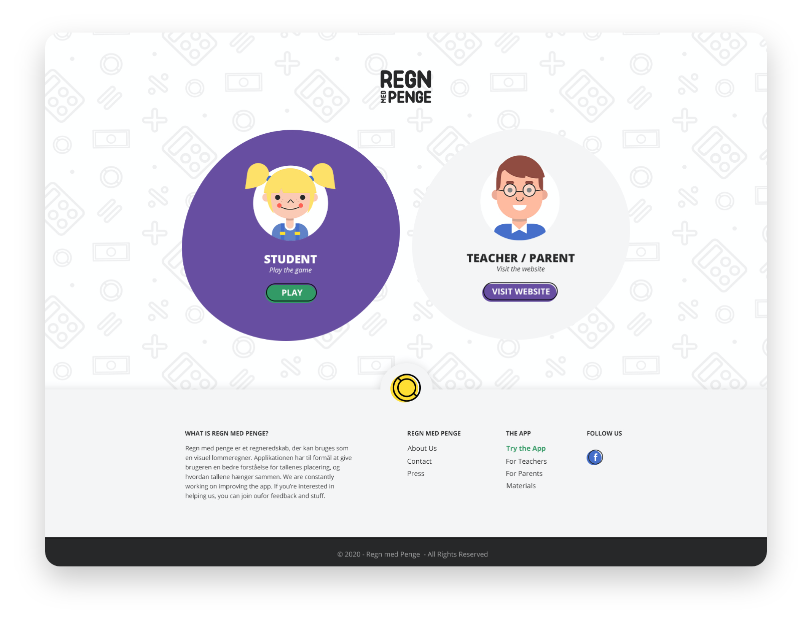
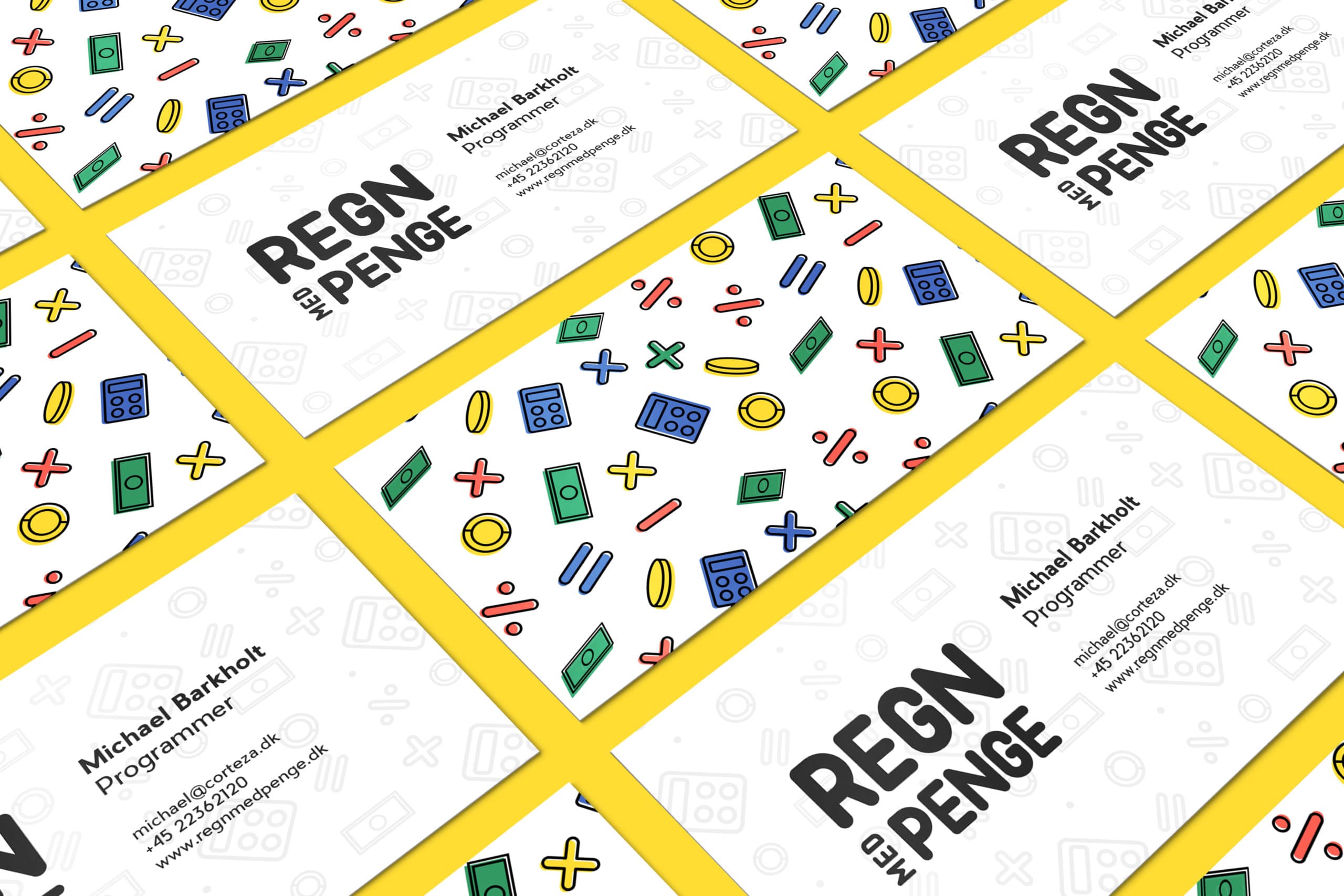
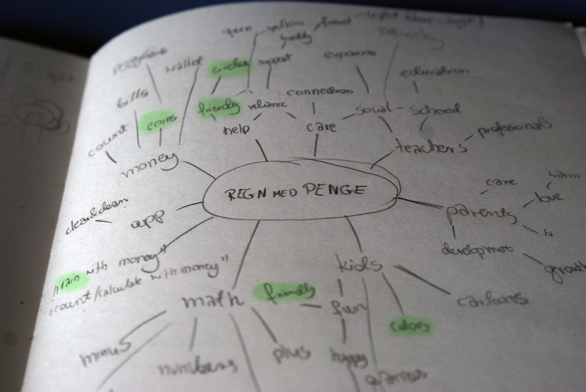
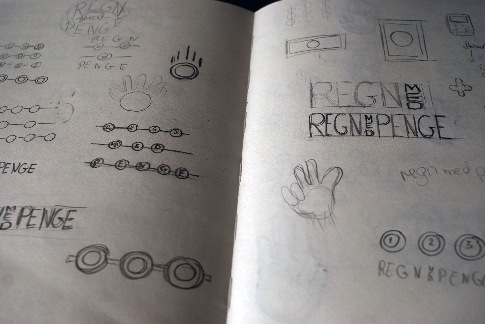
Regn med Penge is a Danish browser app that teaches kids how to count with money in a fun and easy way. My task was to design a brand identity and a website representing the business and the product while appealing to their audience – parents and math teachers, as well as kids who can play the game online.
The visual identity is full of curved edges and vibrant & happy primary colors which make it appear friendly, fun, and exciting. The name of the app means “rain with money” which sparked the idea of making the supporting graphics look like they’re falling from the sky. The logotype itself is made of round letters which add to the warm, playful, and childish brand personality.
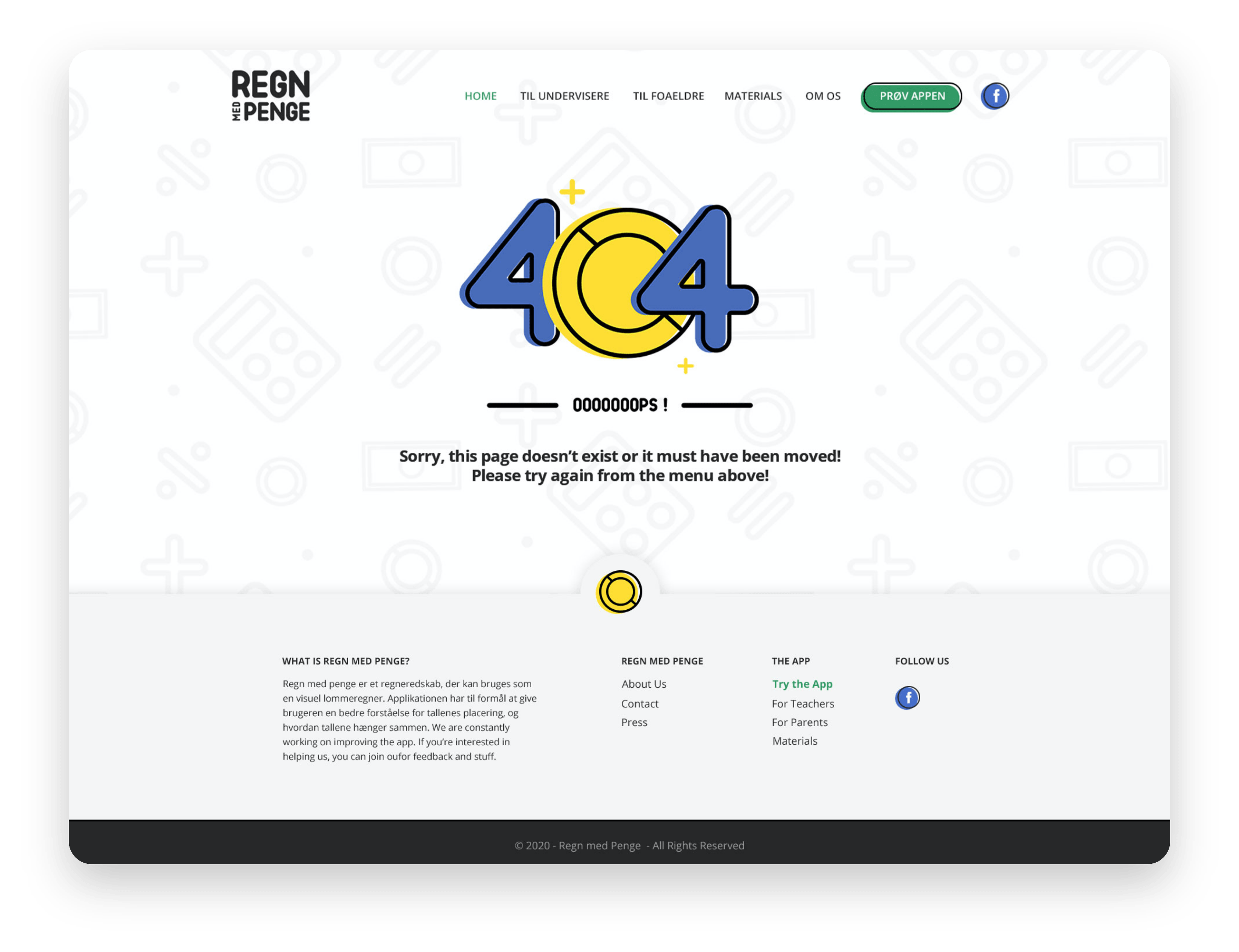
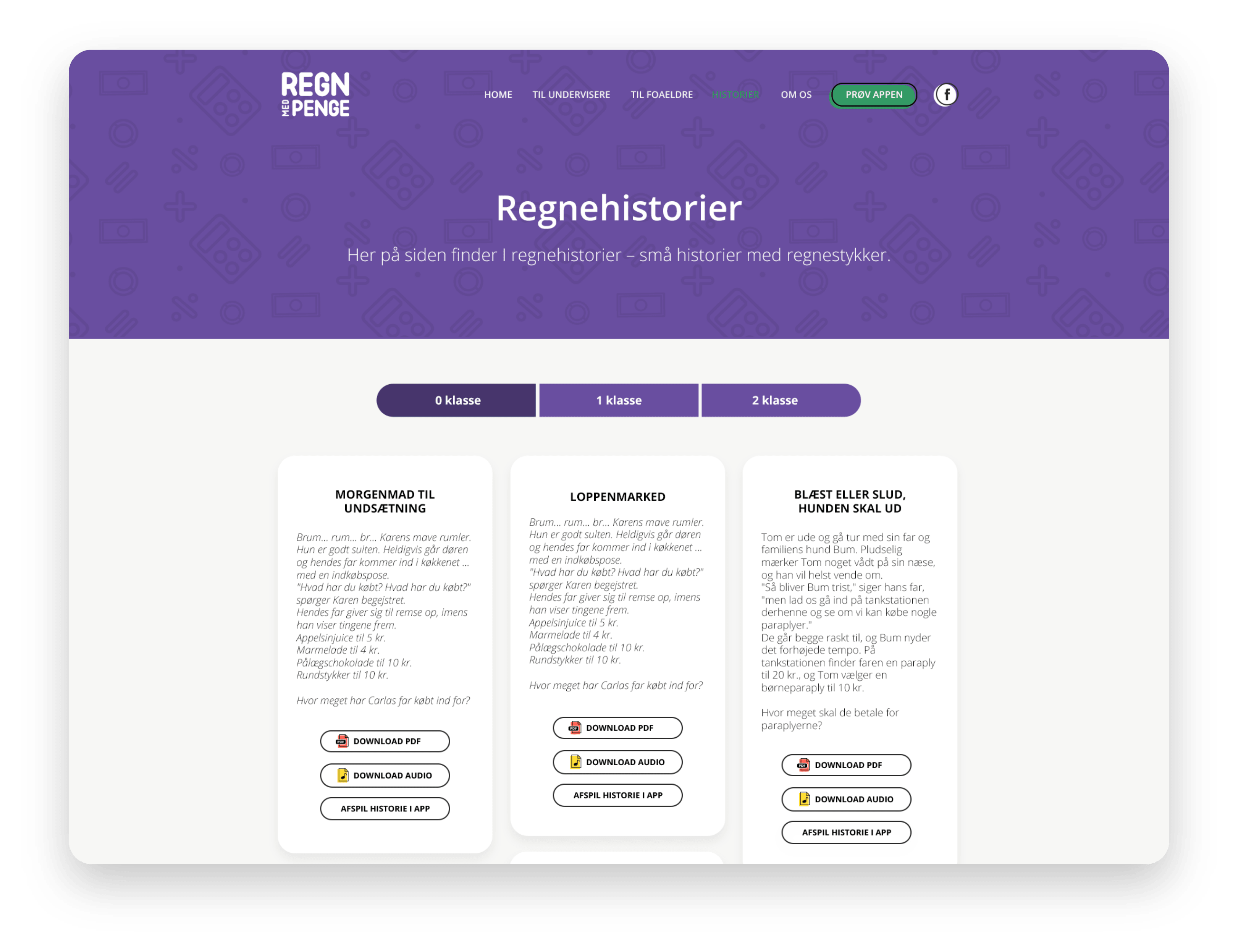
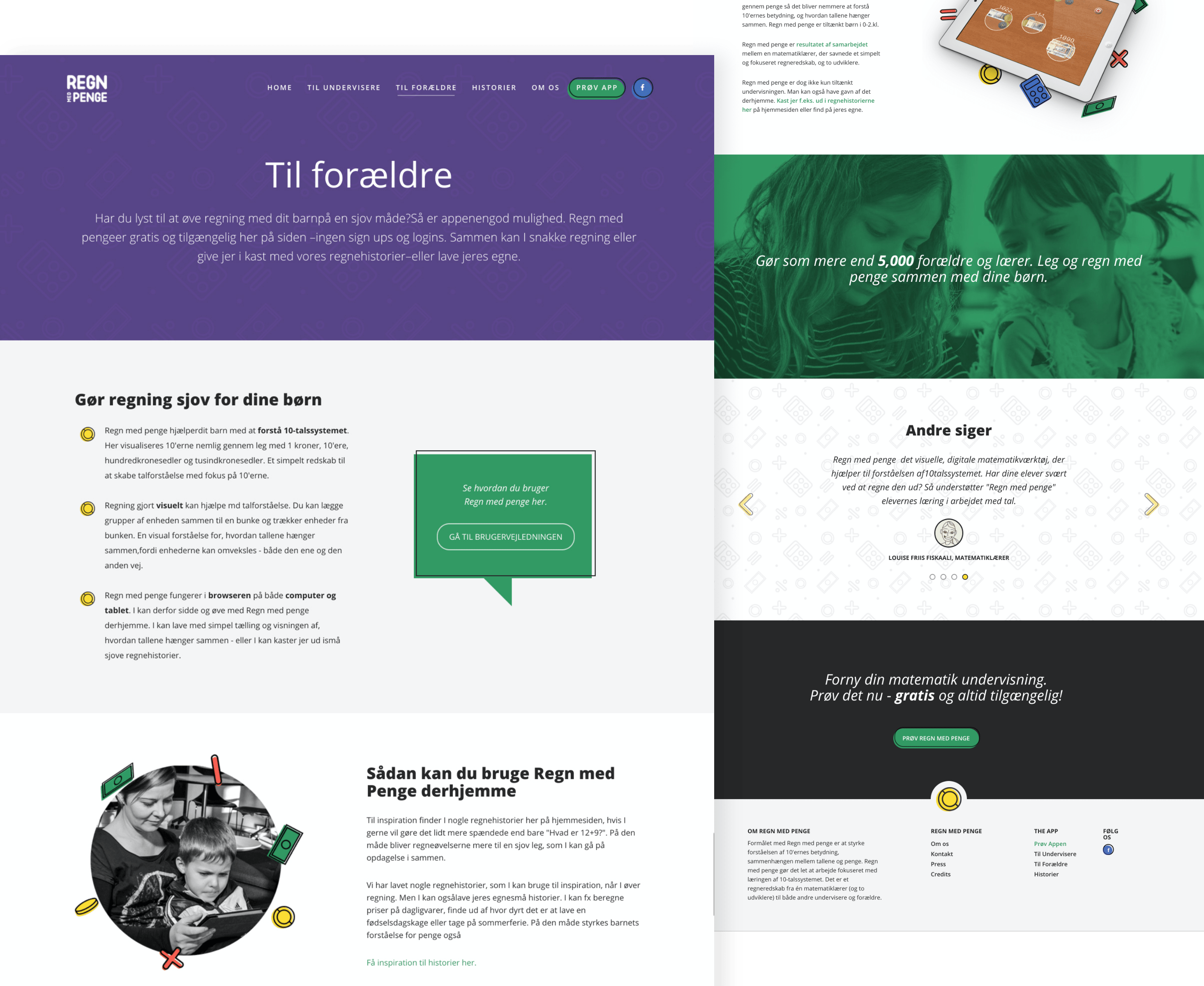
The elements on the website keep up with the visual identity, eg. buttons, background boxes, and images with icons. The look and feel is clear and fresh, showing the professional side of the brand, as well as playful and fun with the use of colors, buttons and graphic elements. Friendly pictures, quotes from both teachers and kids and additional materials subpages build trust and credibility.
The elements on the website keep up with the visual identity, eg. buttons, background boxes, and images with icons. The look and feel is clear and fresh, showing the professional side of the brand, as well as friendly and playful with the use of colors, buttons and graphic elements.
The main purpose of the website is to let people try the online app. This is made by providing big call to action buttons which redirect the users to the app itself. Friendly pictures, quotes from both teachers and kids and additional materials subpages build trust and credibility.
The elements on the website keep up with the visual identity, eg. buttons, background boxes, and images with icons. The look and feel is clear and fresh, showing the professional side of the brand, as well as playful and fun with the use of colors, buttons and graphic elements. Friendly pictures, quotes from both teachers and kids and additional materials subpages build trust and credibility.